Simplifying the Visual Identity for Loyola College’s Viscomm Department
The department of visual communication at Andhra Loyola is the first in Andhra Pradesh to offer a UG degree in creative disciplines taught by a faculty comprising artists, writers, photographers, and designers.
In my final year graduation, I was asked to re-design the viscomm department visual identity to bring more clarity and consistency for the department’s visual language.


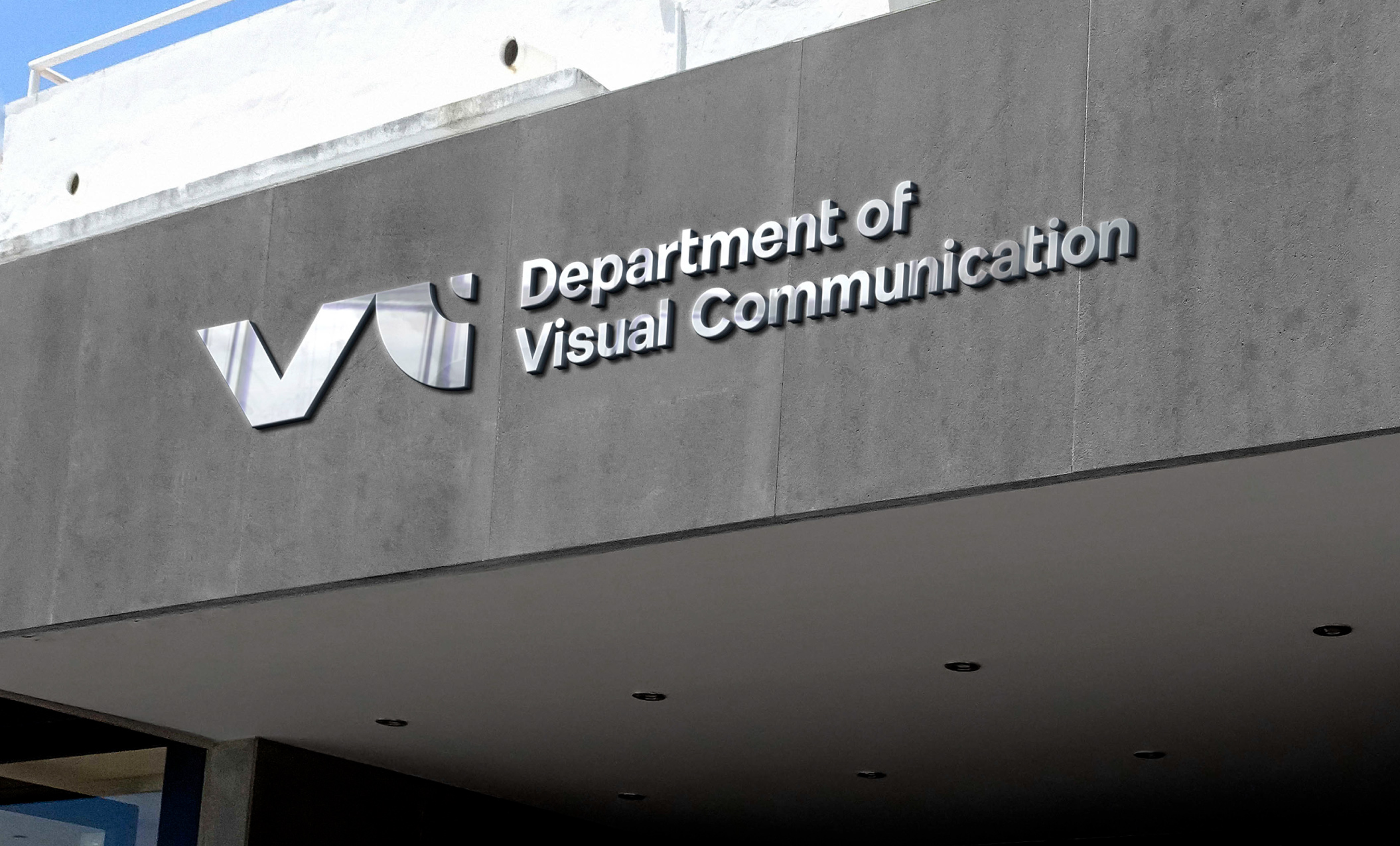
Even though the old logo has a camera I avoided doing similar motif to not to make it look like it specializes in that particular field only. So, I designed a simple and strong monogram that improves the recognizability of the Viscomm department. logo paired with a clean san-serif typeface which compliments the monogram.

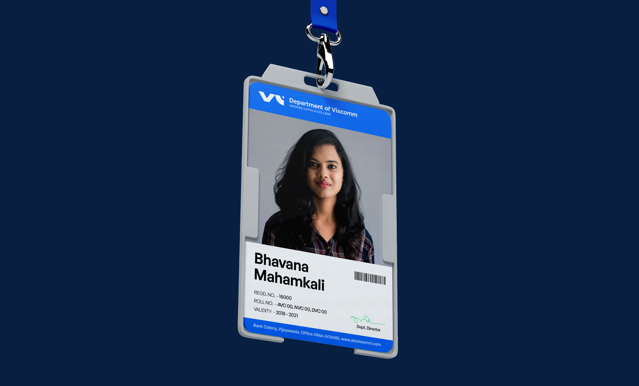
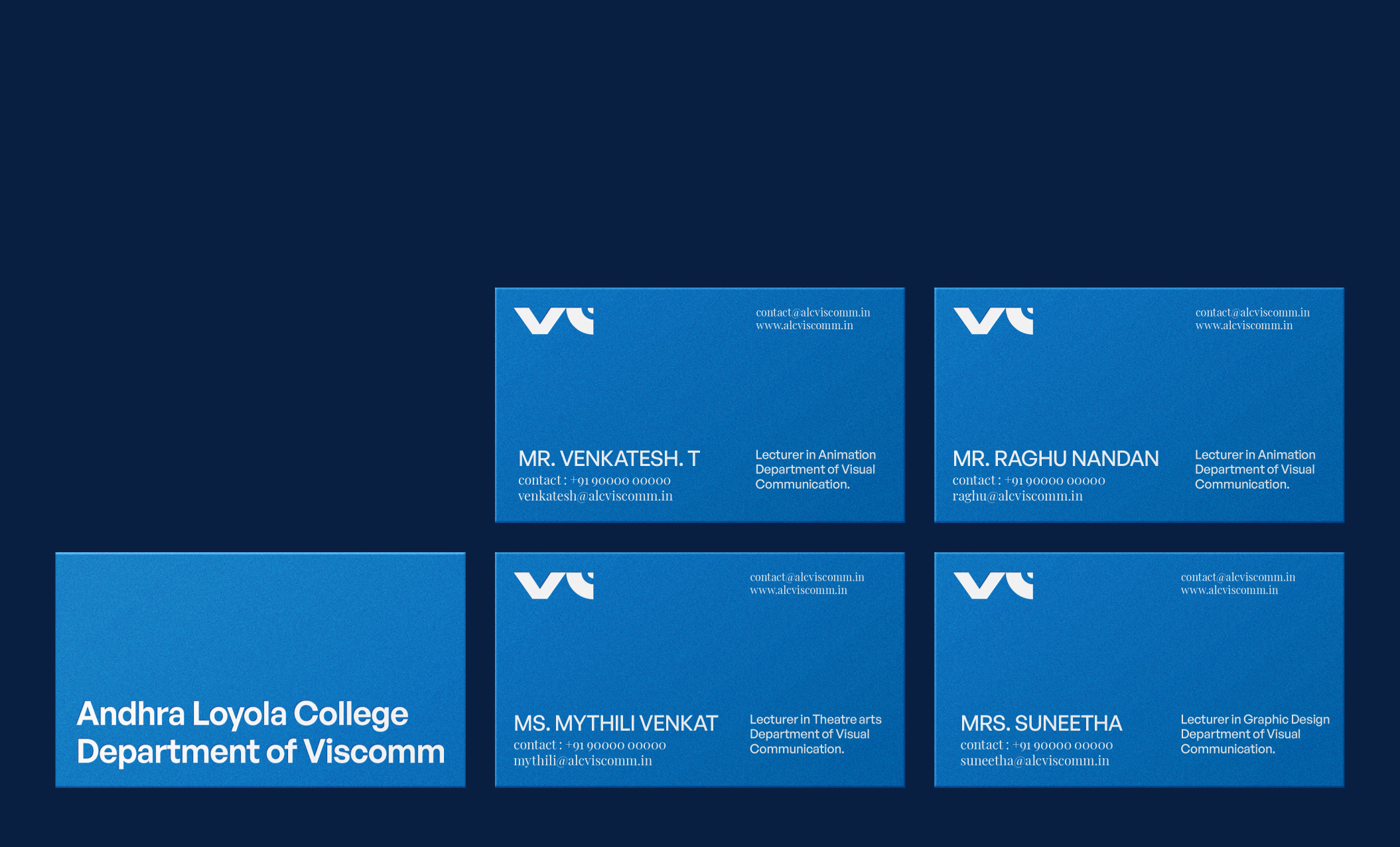
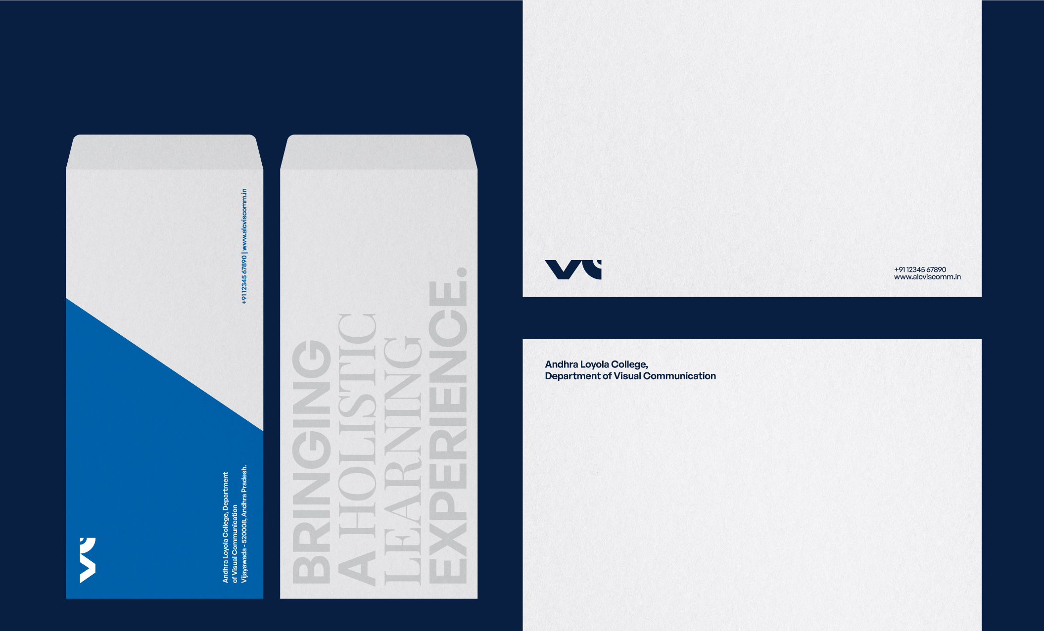
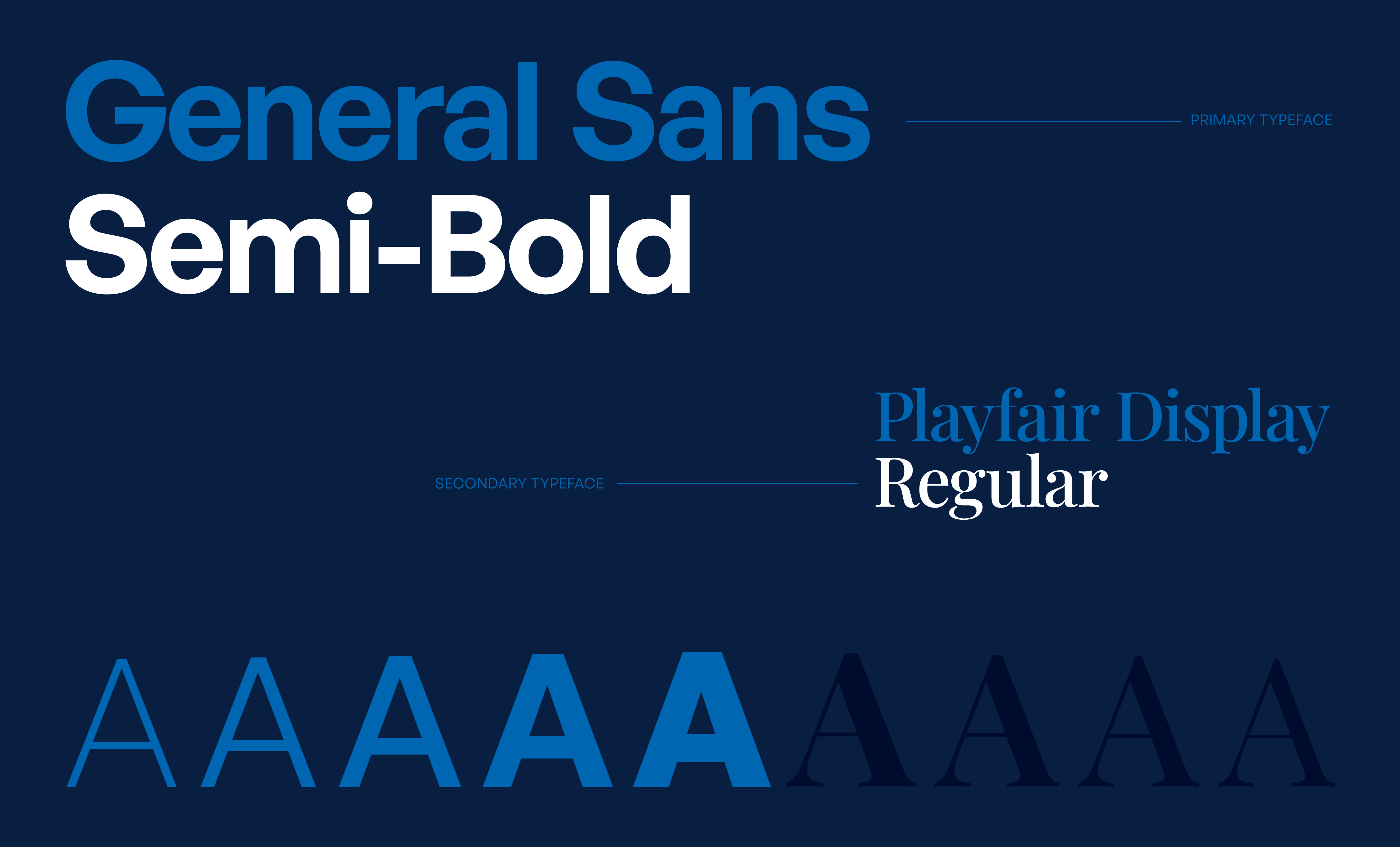


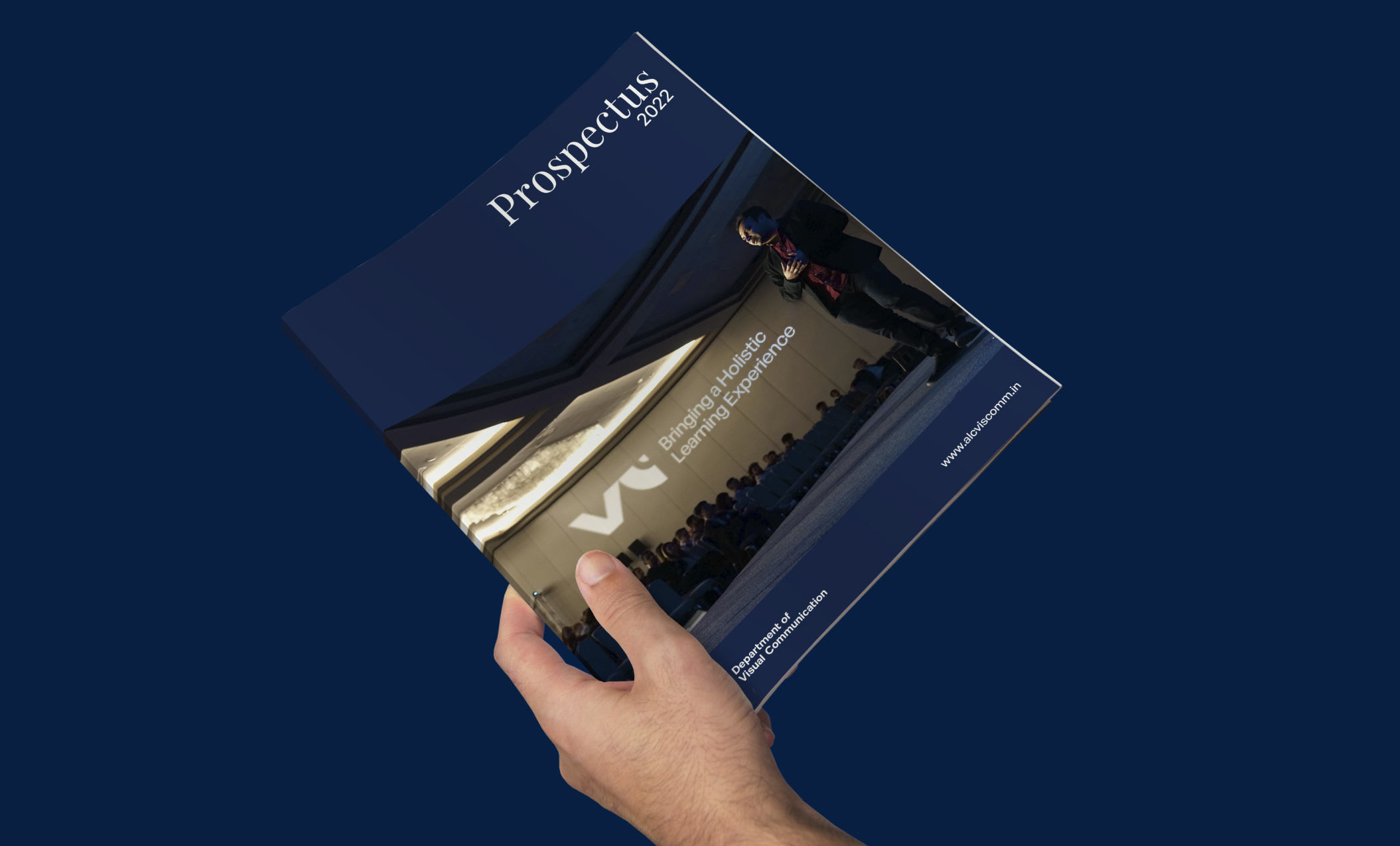

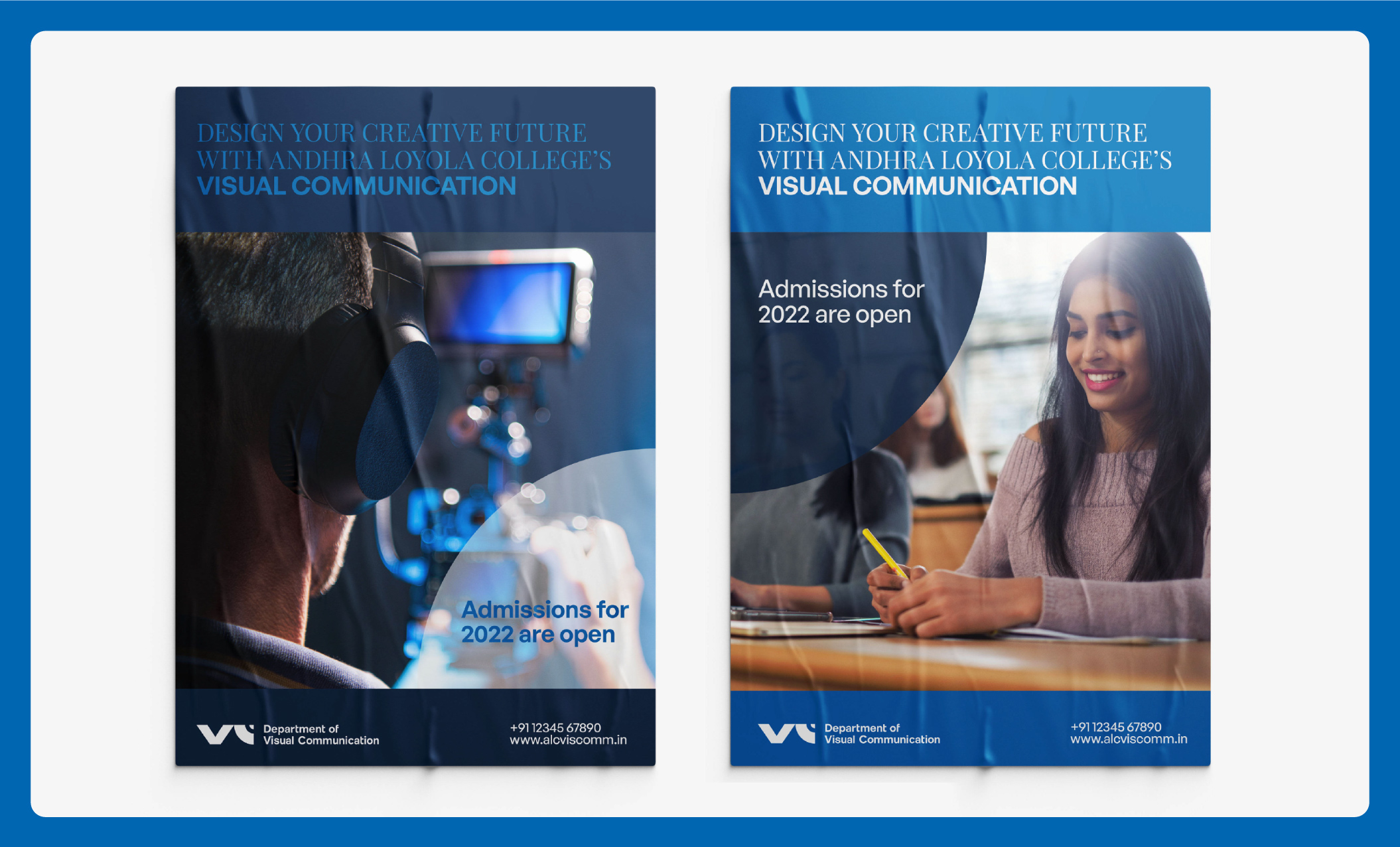
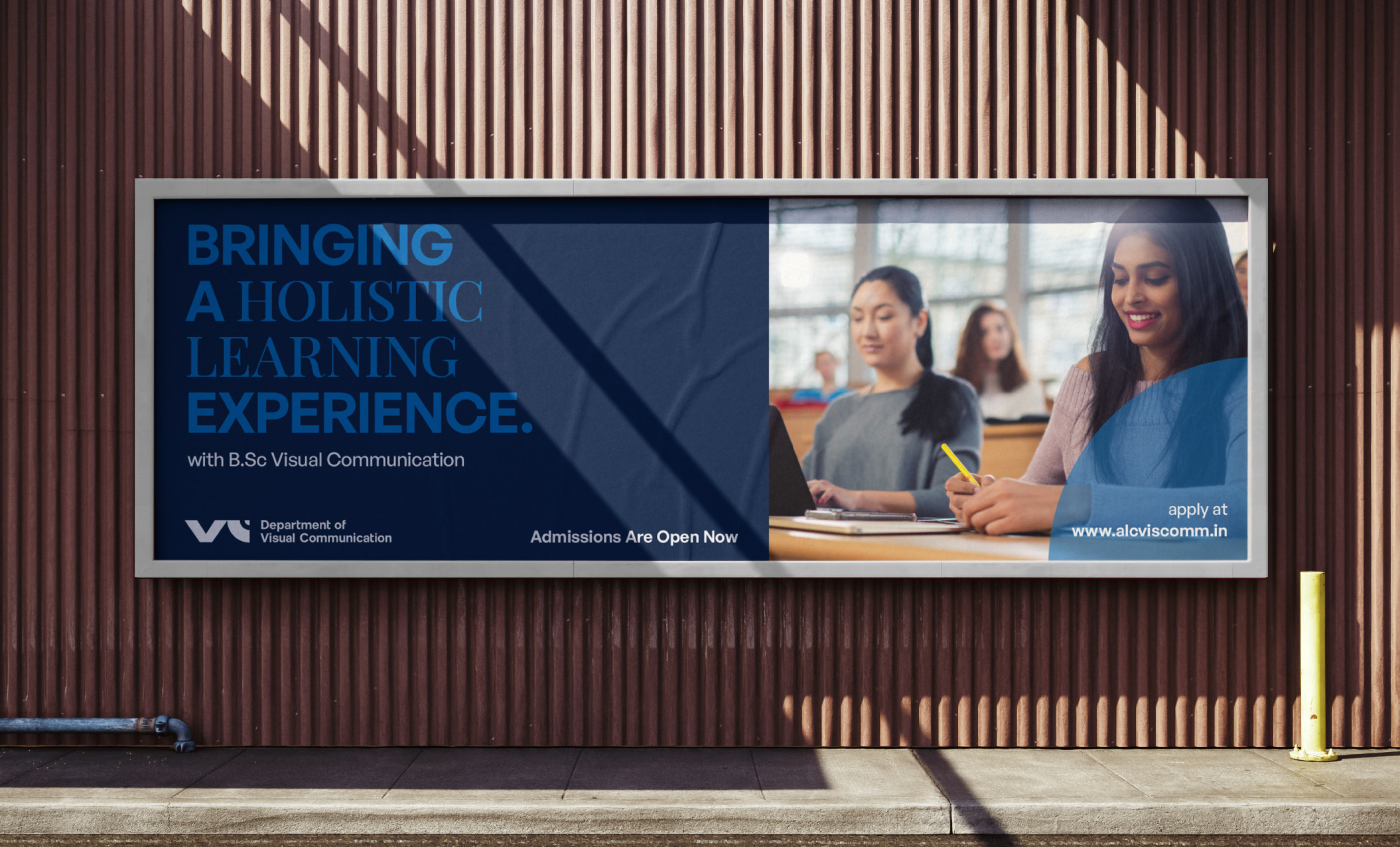
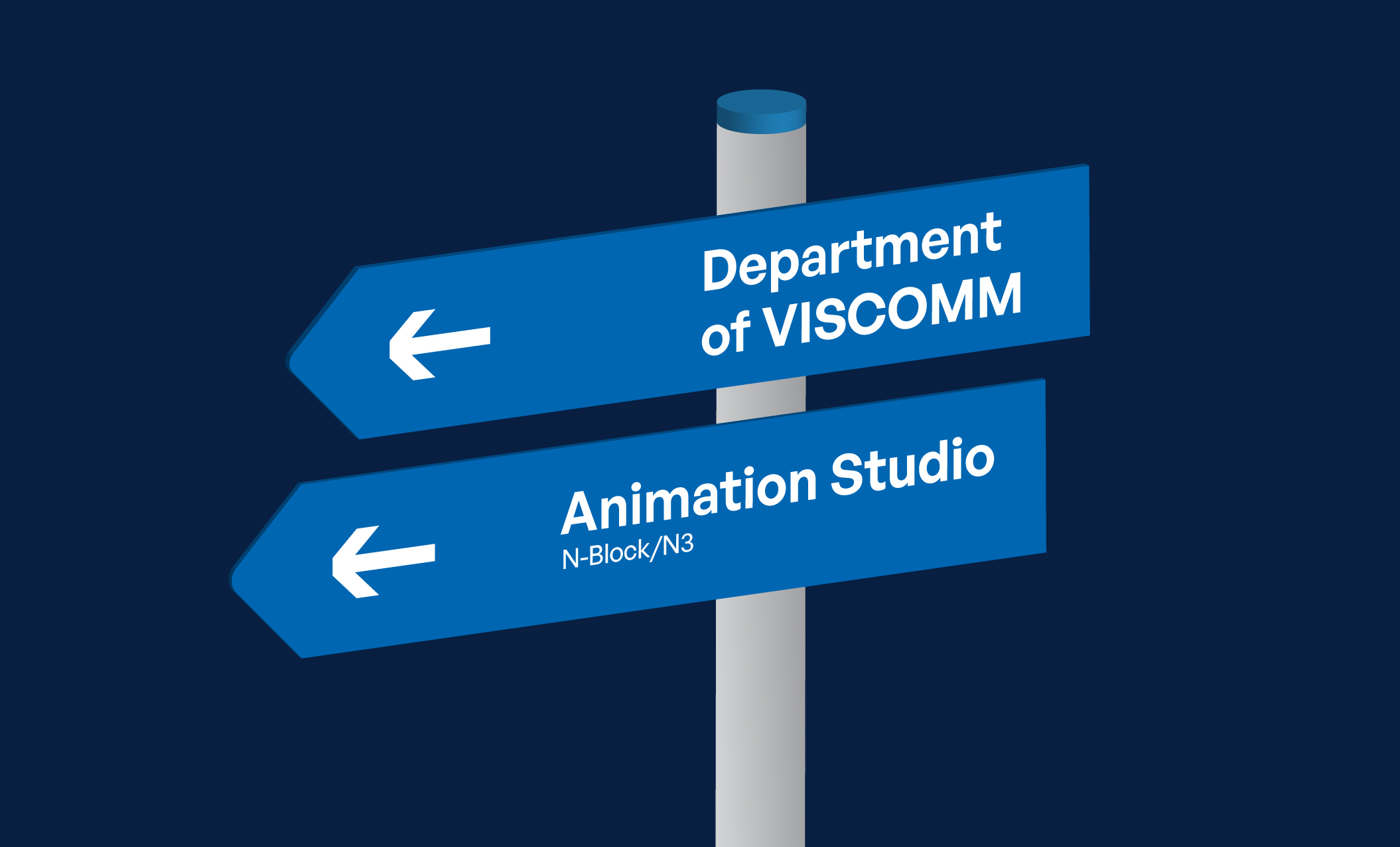

Having a simple monogram with a clean typeface makes it look modern, represents the personality of the viscomm department. Using a clear graphic identity helped Viscomm to communicate more effectively and consistently across their communication collaterals.


