Helping an established builder step into a new era of growth and transformation with a dynamic visual identity.
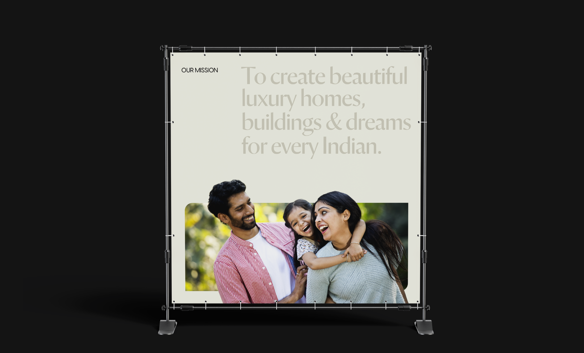
SNN Raj Corp looked like they had it all. 6000+ happy customers, prominence in the real estate industry, several cutting-edge projects in the works. But they felt misaligned with their brand identity, and wanted it to reflect the high standards they set for themselves, and resonate with their audience. We got to work.
This project was completed by me during my design tenure at parentheses design studio
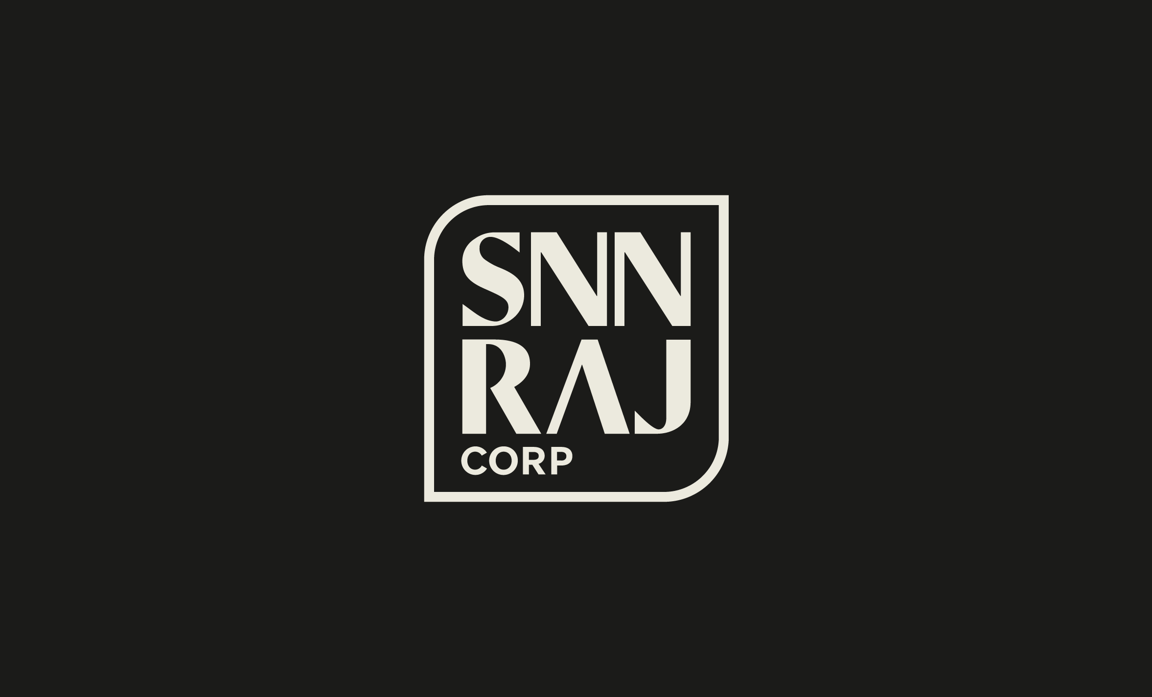
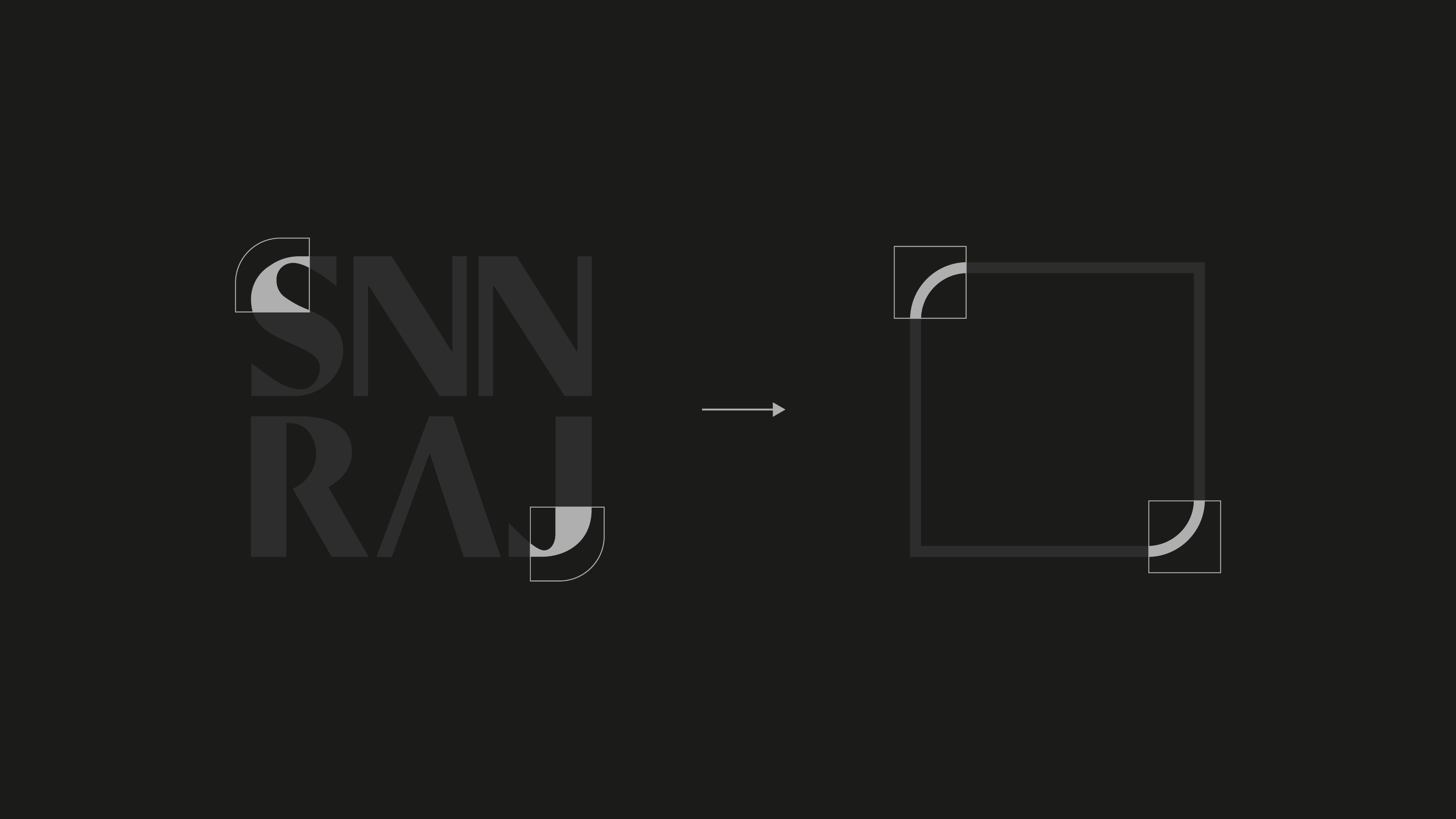
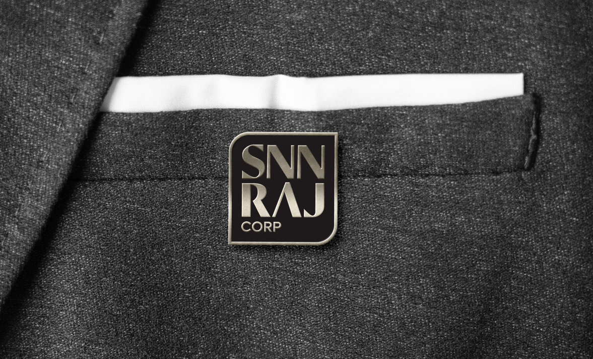
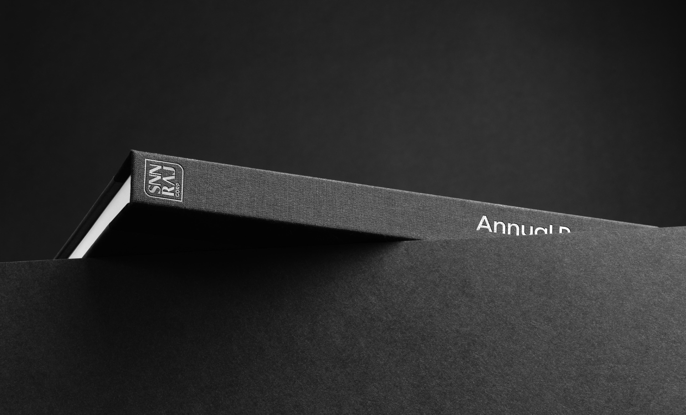
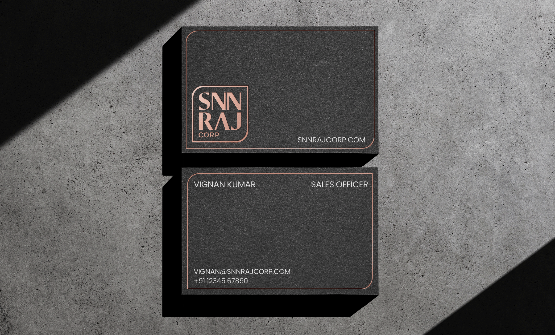
We conceptualised a wordmark to draw upon the decades long prestige associated with the SNN Raj name. It took the form of a square with well placed curves. The frame containing the logo is derived from the font constituting the logo itself. The curve of the S and J form the distinctive curved edges of the container for an organic combination of lines and type.
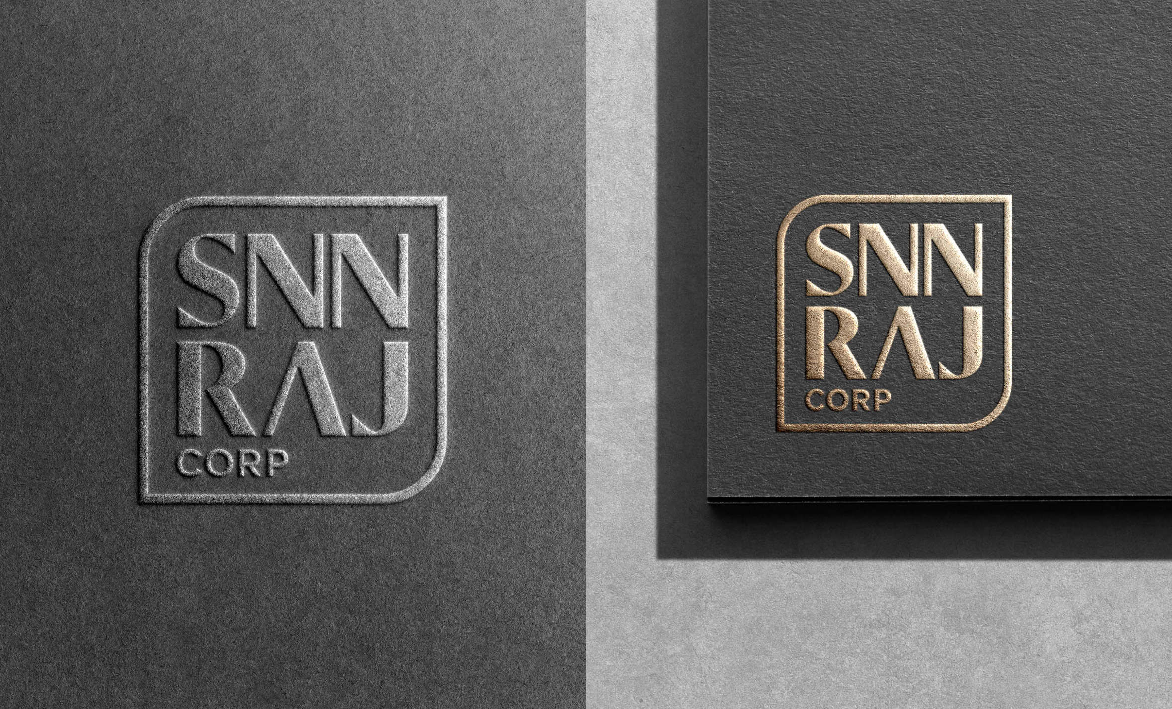
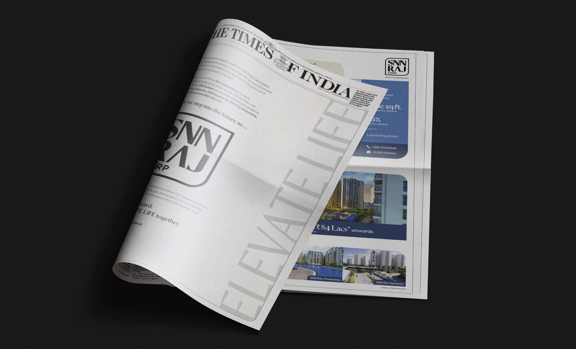
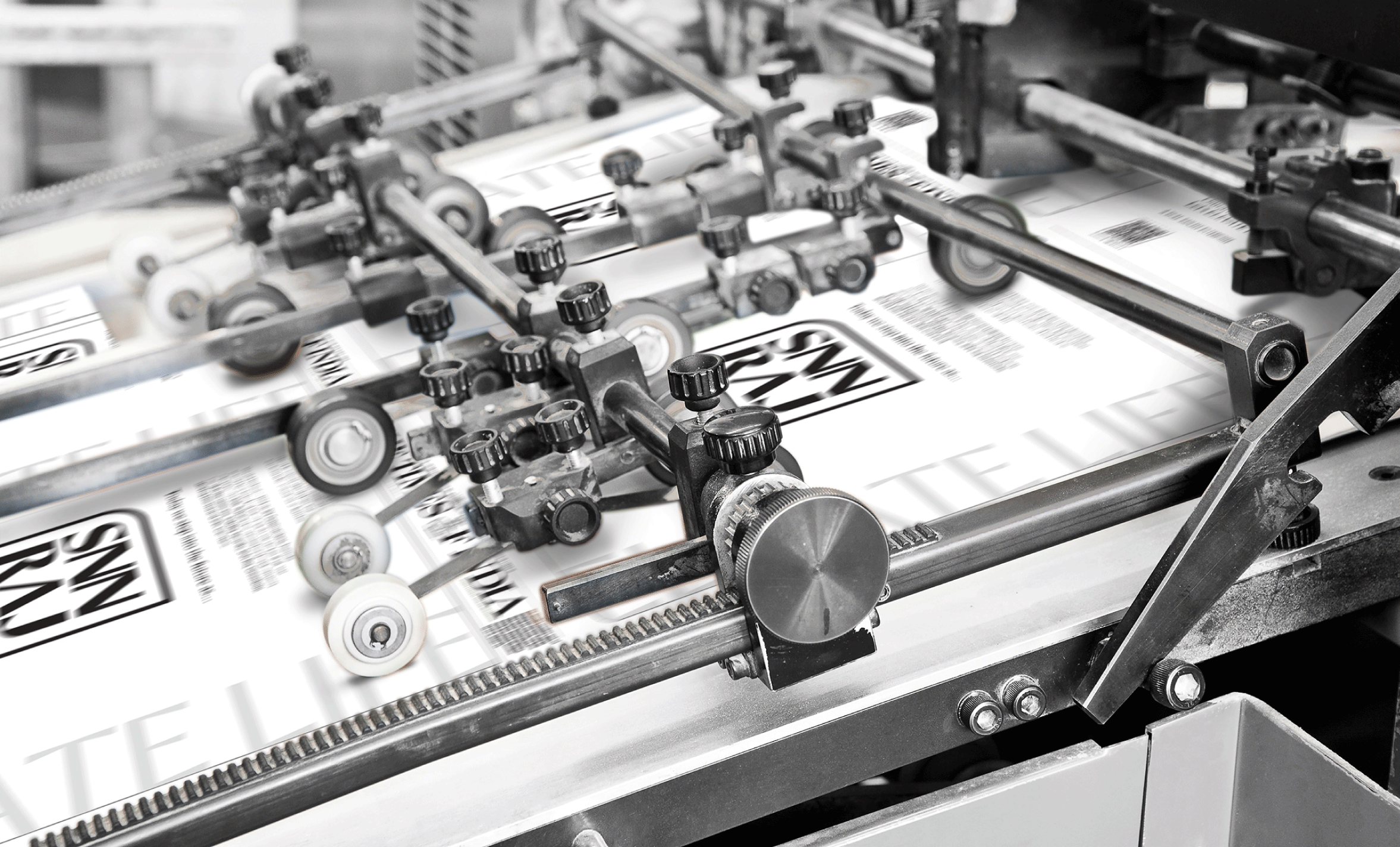
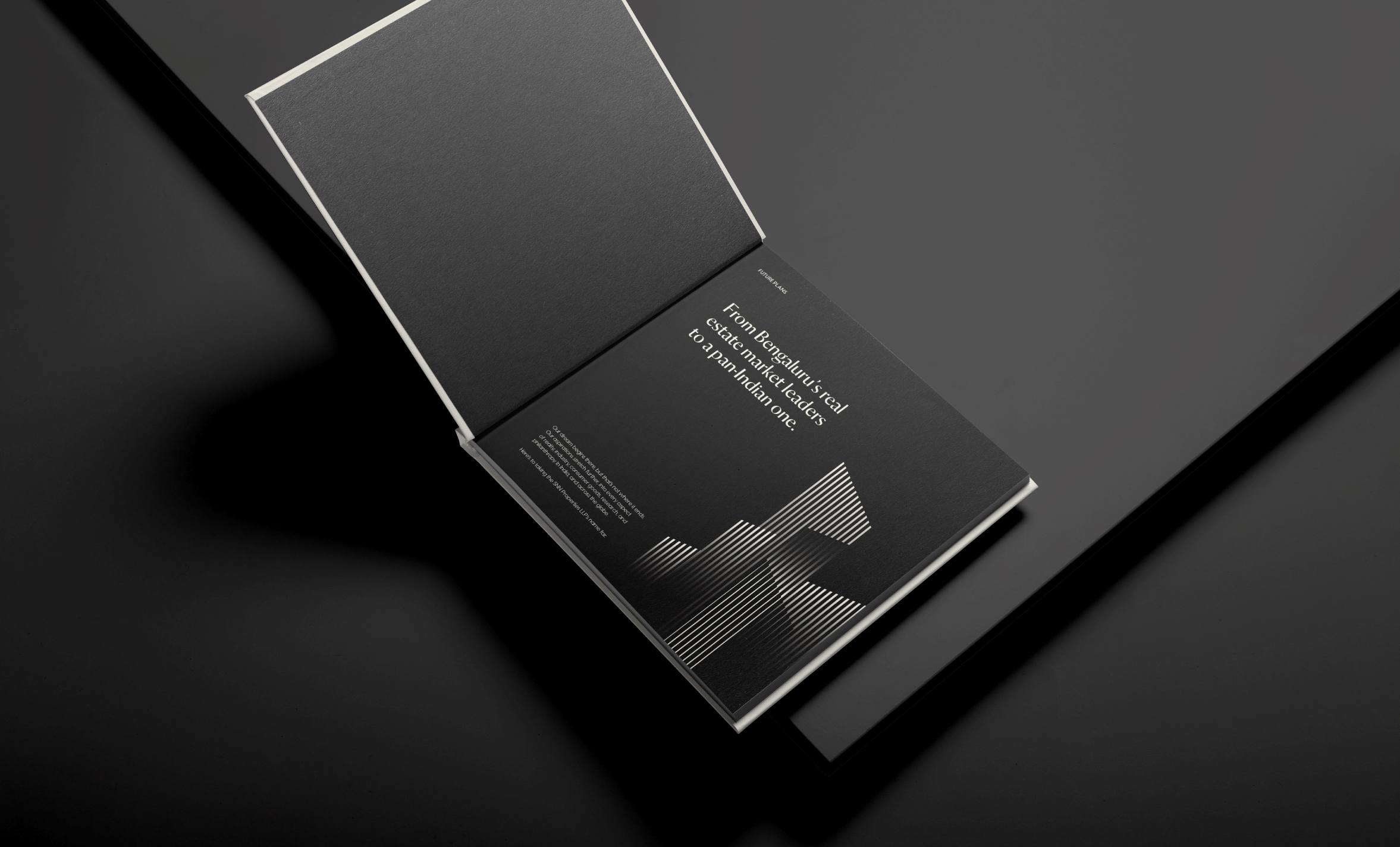
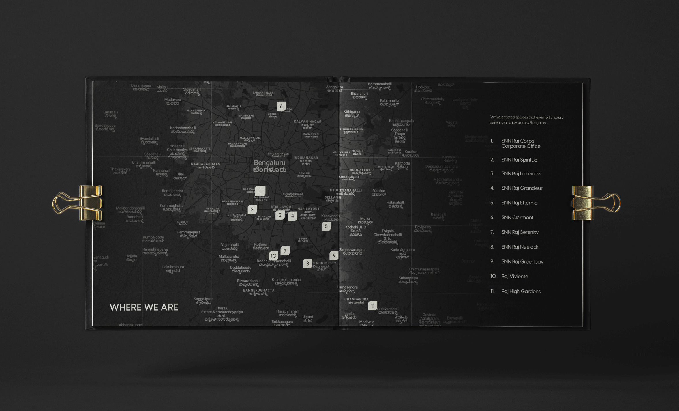
SNN Raj Corp has now embraced an identity that mirrors its vision and ethos, marking the new era of growth in construction and design.


