Transforming tradition into the future with innovative visual Identity

This project was completed during my design tenure at Parentheses, as a part of the studio's design team.

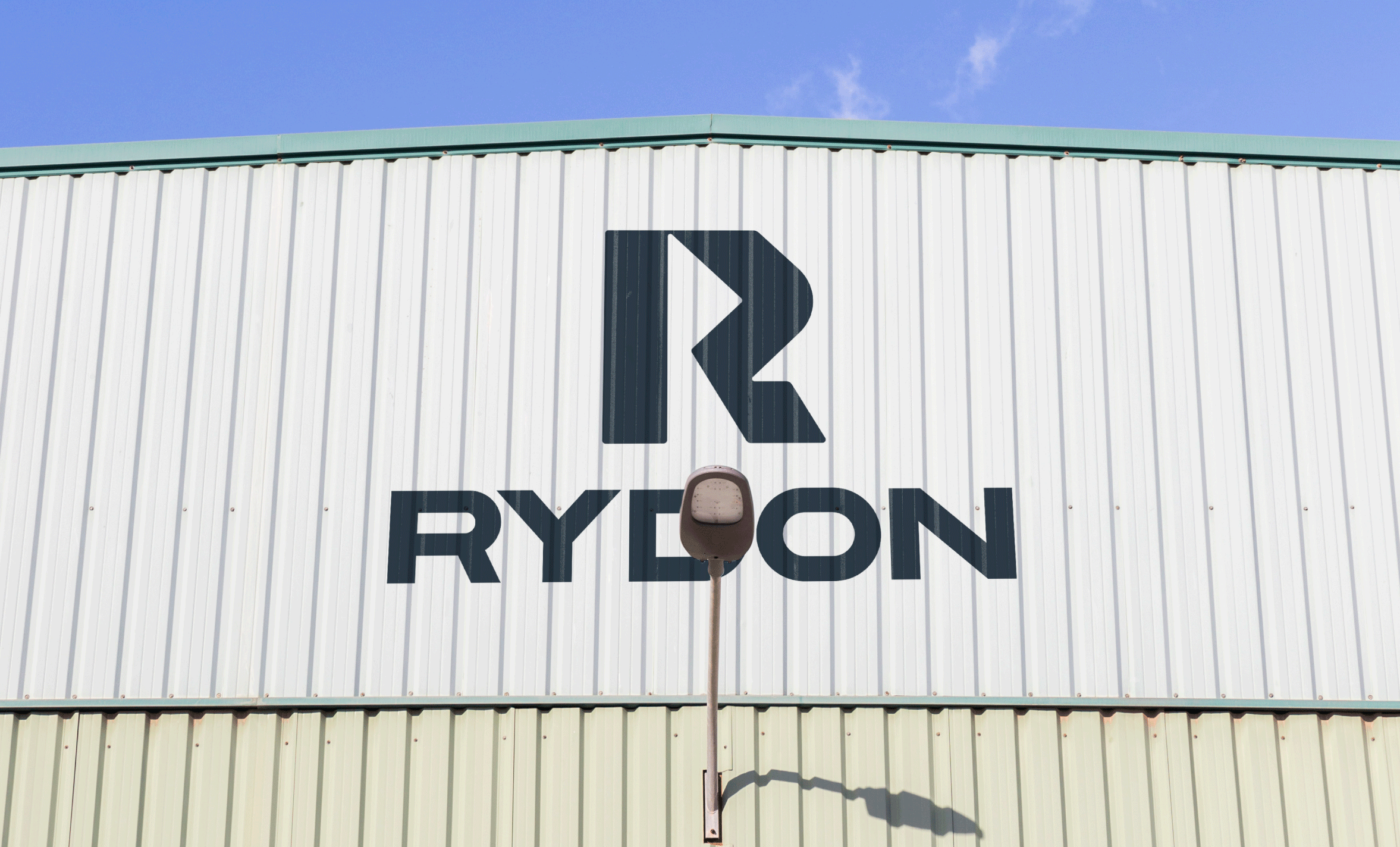
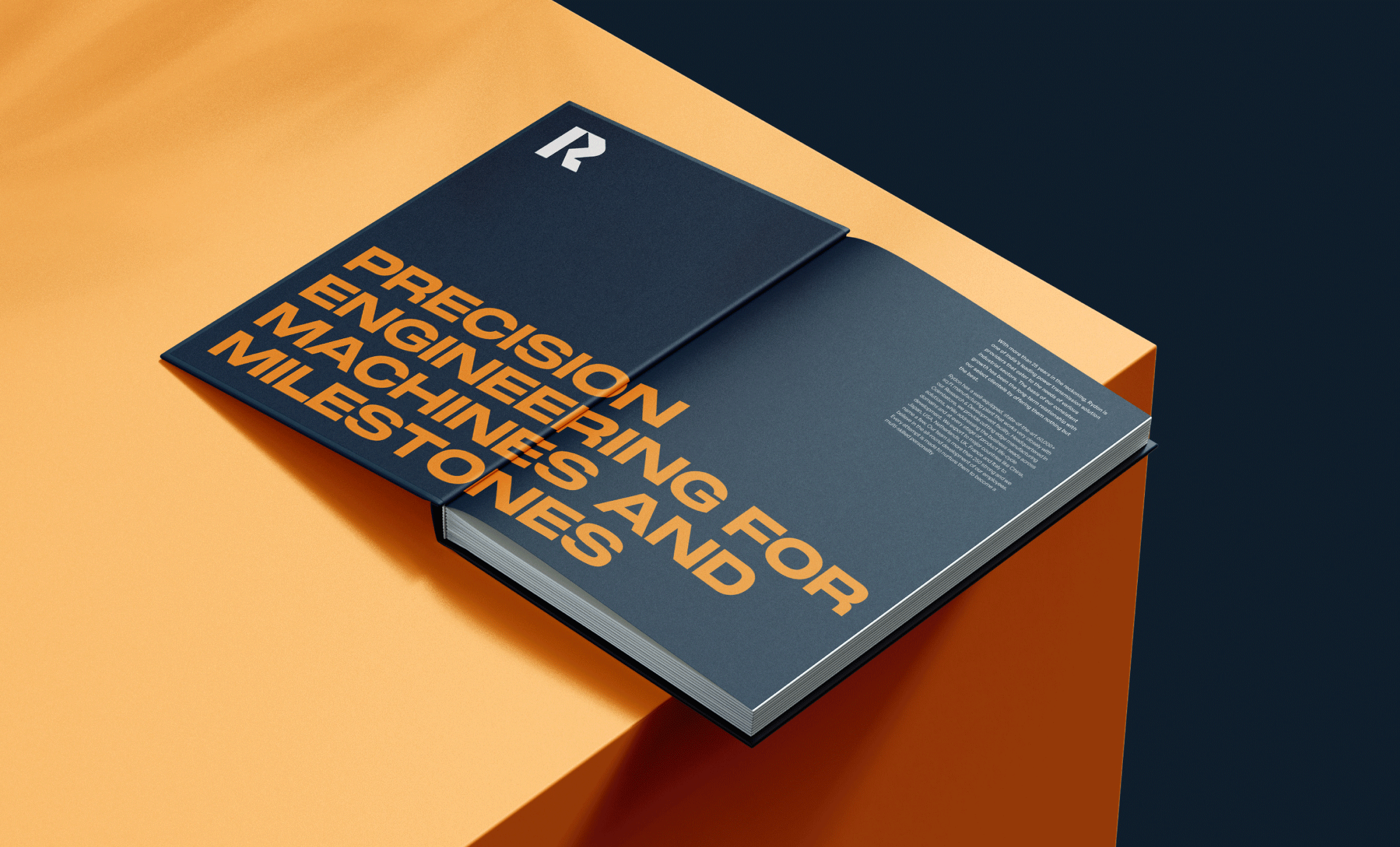
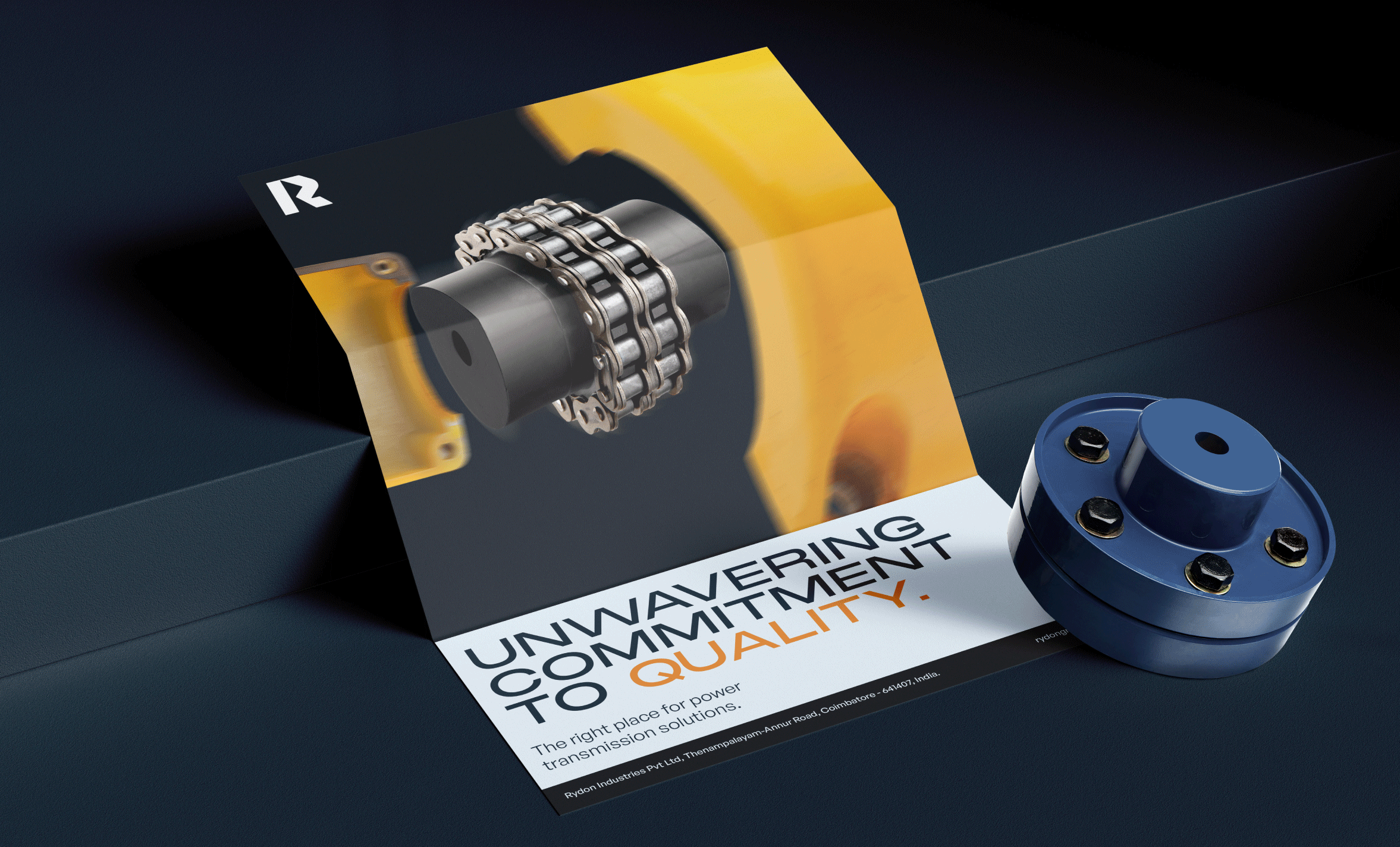
For 33+ years, Rydon has been keeping up with a demanding world, innovating ceaselessly to become one of India's prominent providers of power transmission solutions. By rebranding them, we found the sweet spot between old and new to give them an identity that was modern, but traditionally grounded in who they have been for 33+ years.

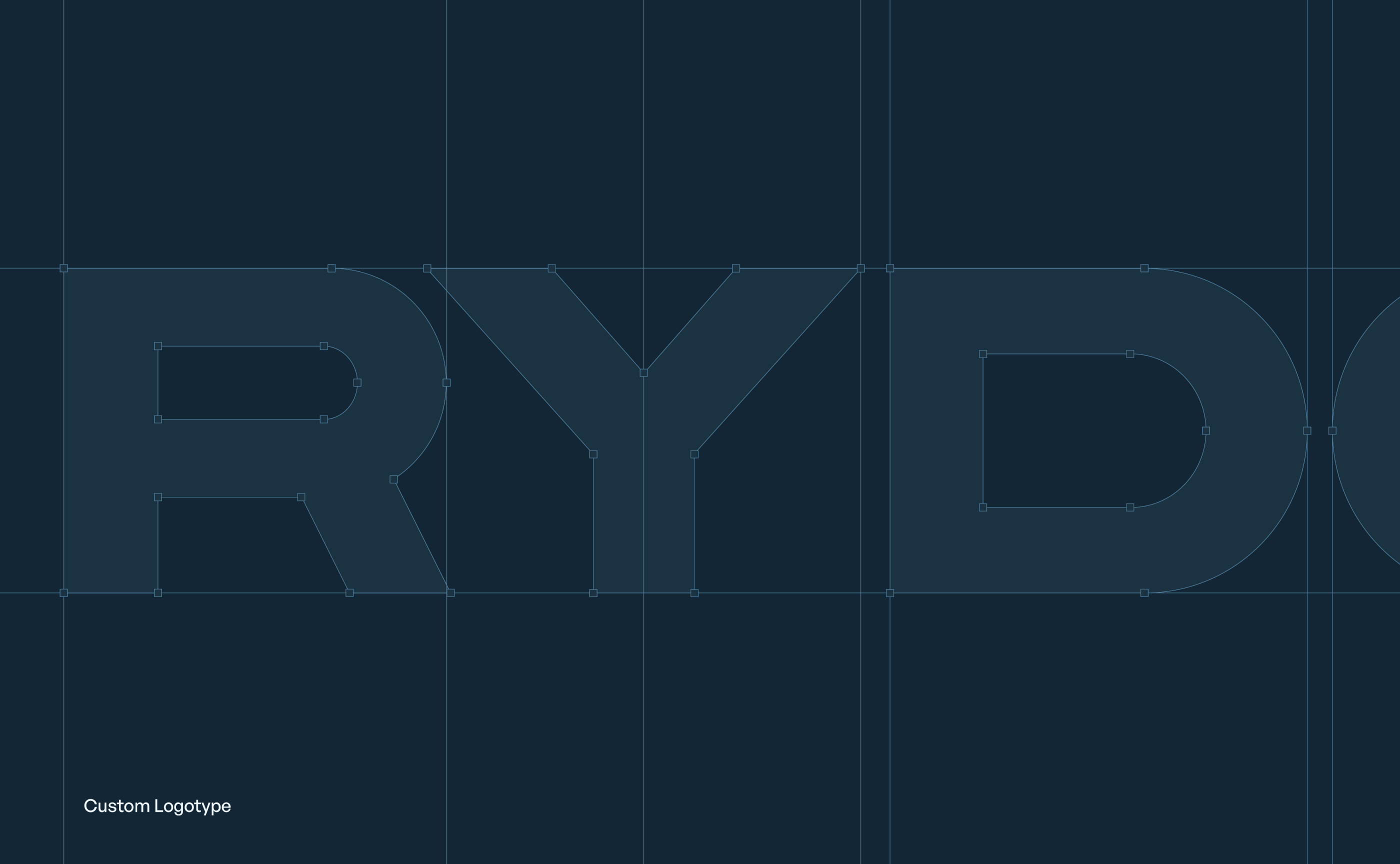
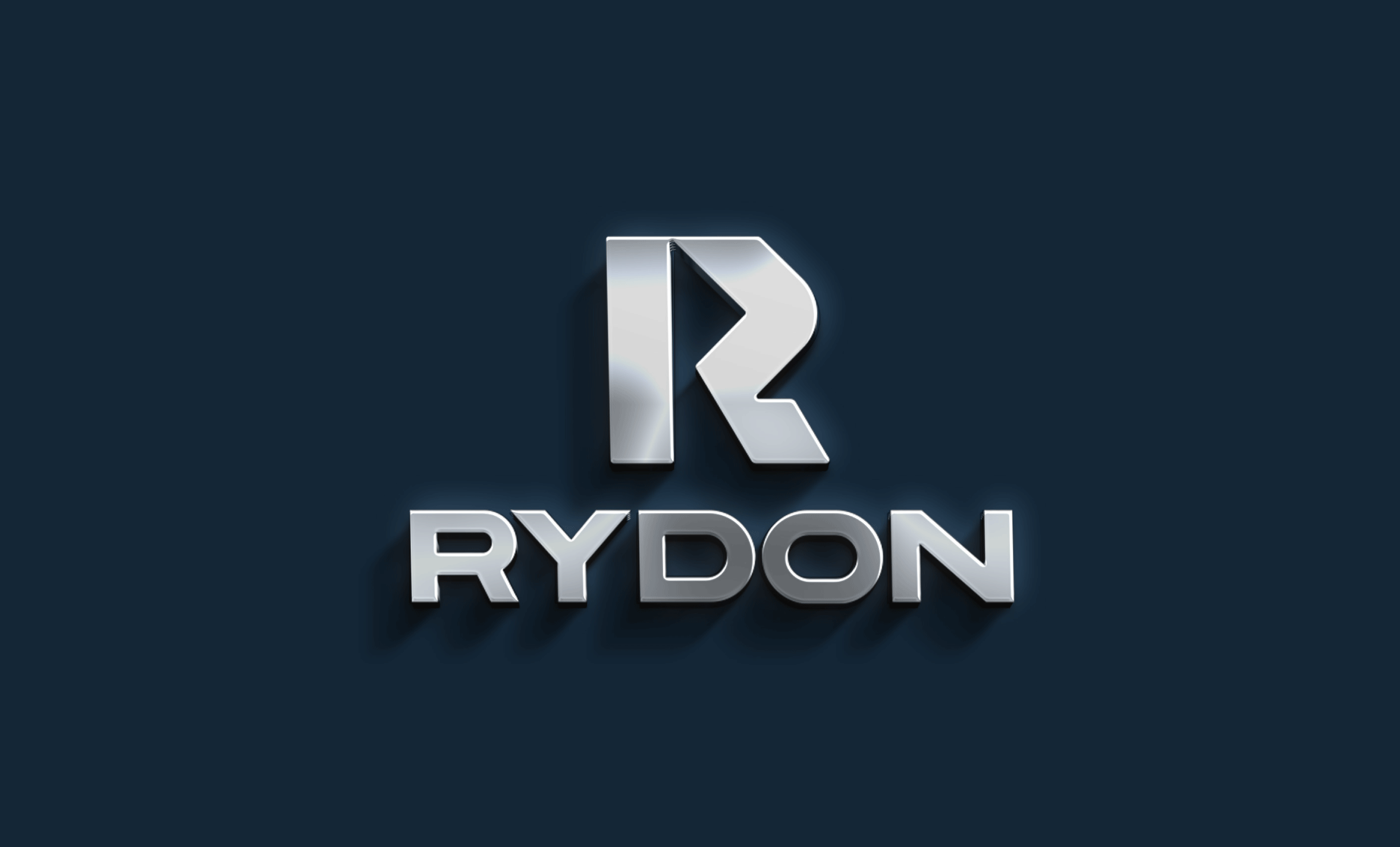
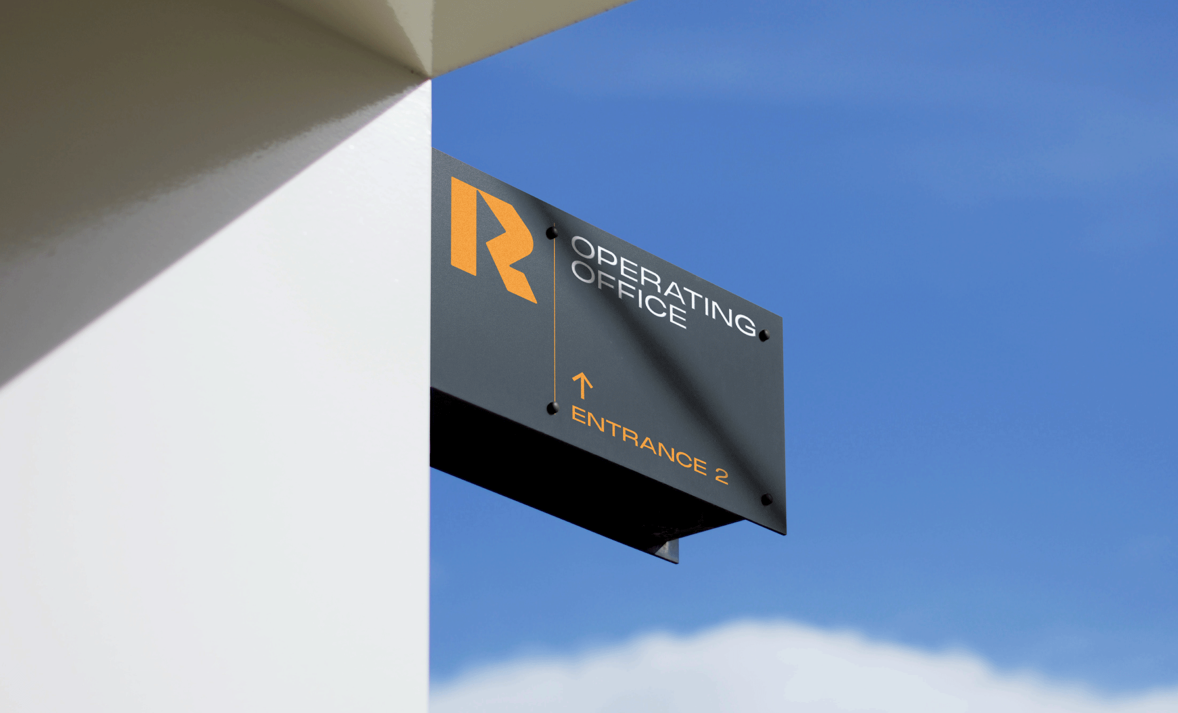
While crafting the Rydon's new logo and identity, we tested many many fonts but ultimately used a custom typeface. The aesthetics had to spot on, but function played a huge part — we worked closely with multiple teams to ensure that this logo was working well at all scales, when when engraved on small chains and other components.

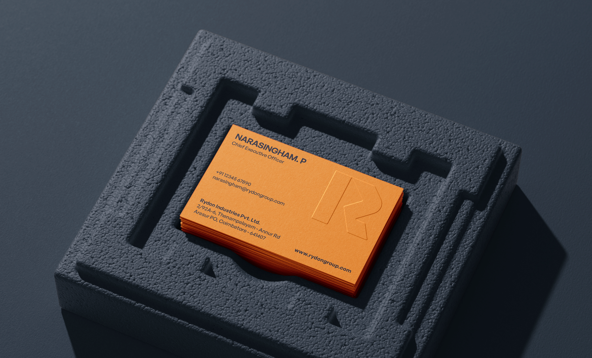
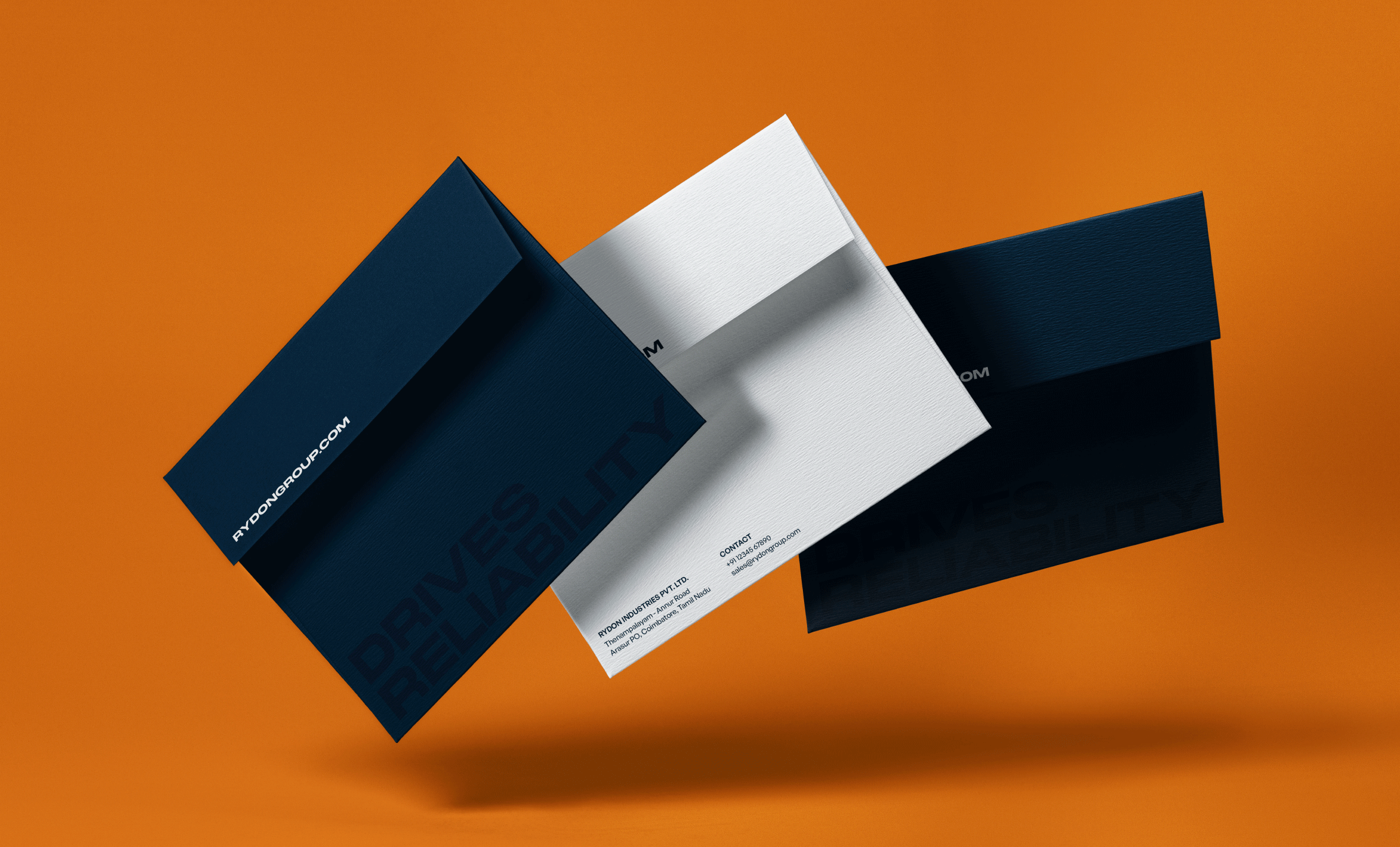
The colours and font worked to balance extremes, resulting in an identity that looked modern and industrial, with the kind of credibility that a company of this stature deserved.

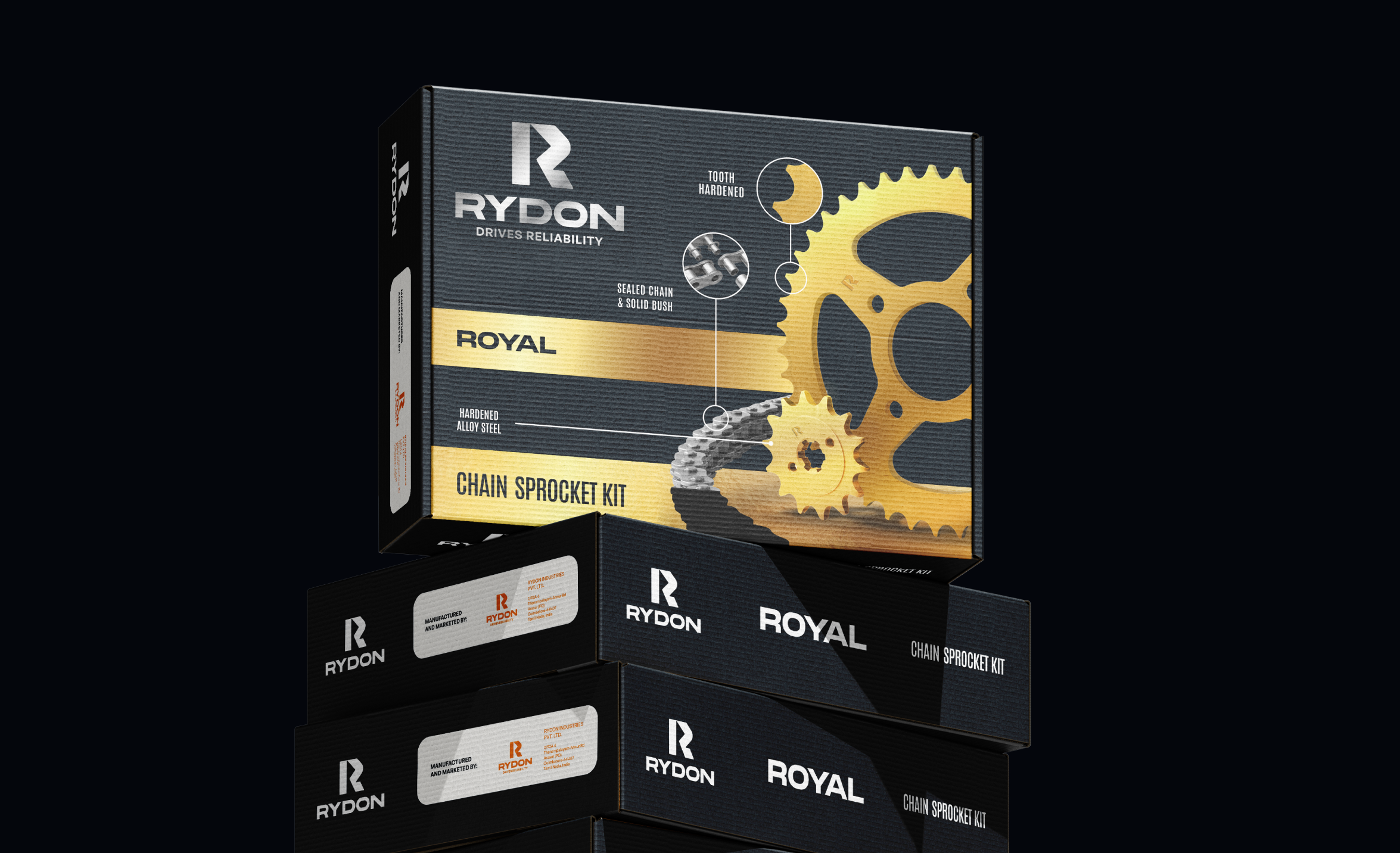
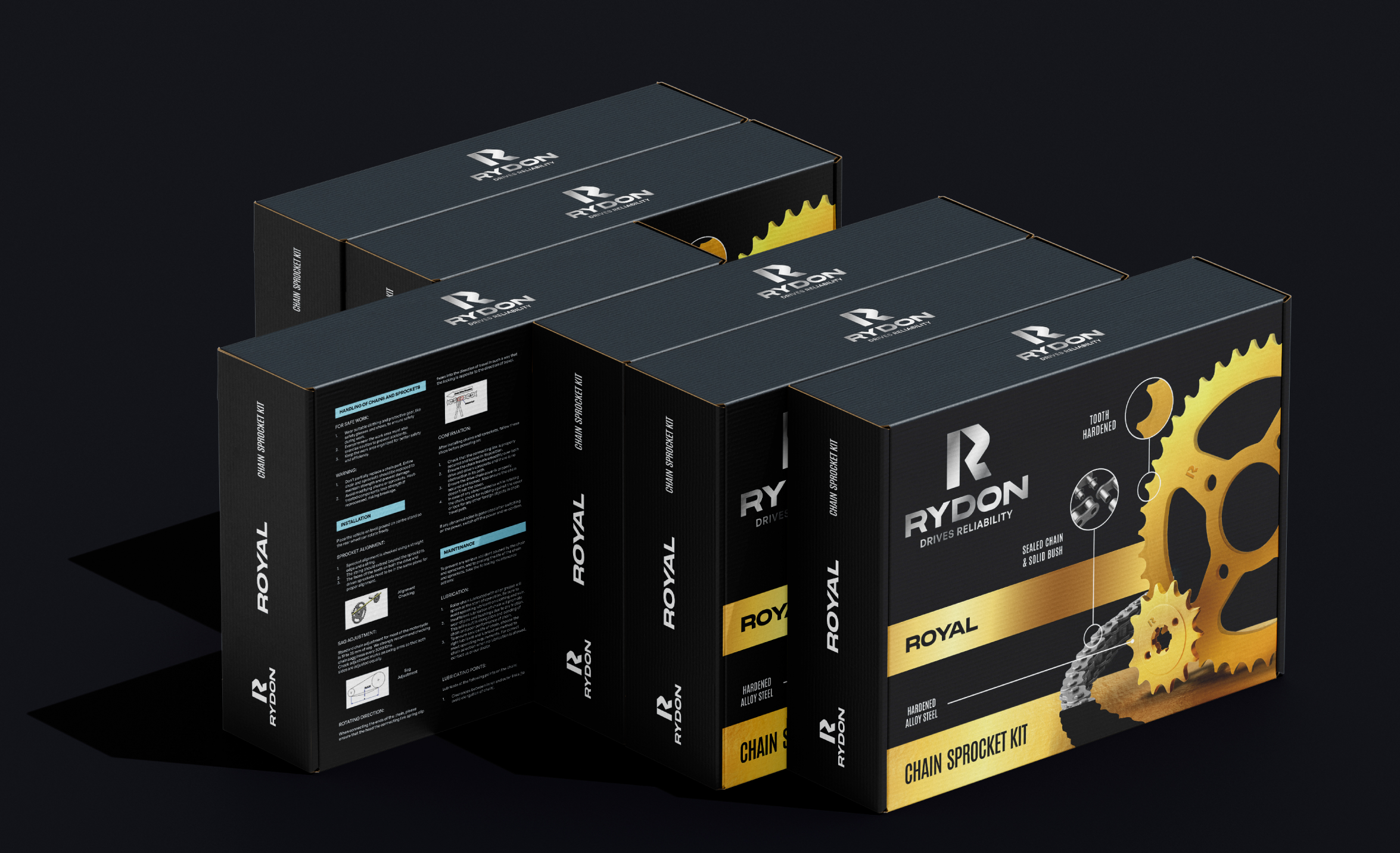
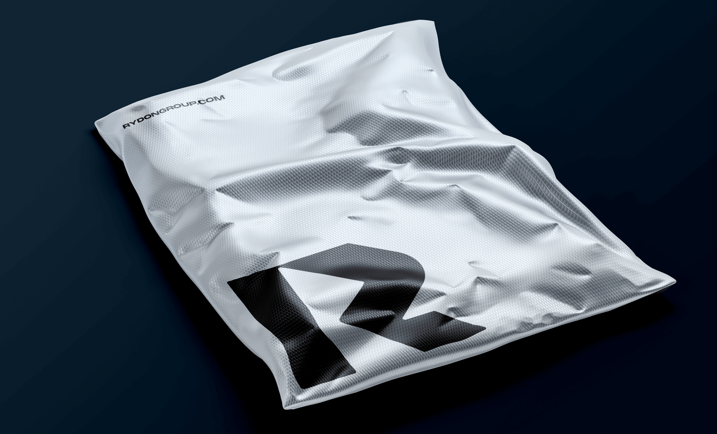
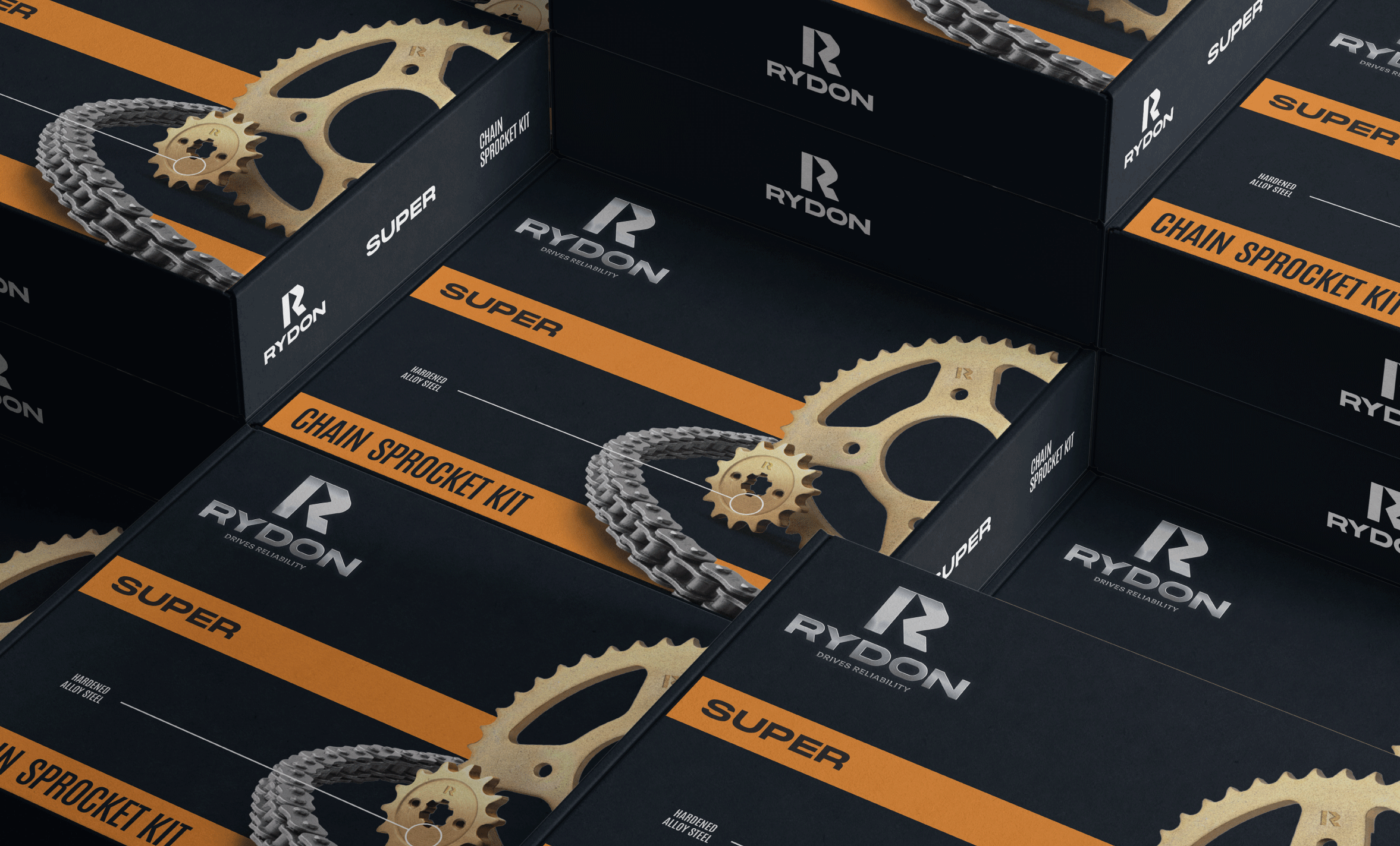
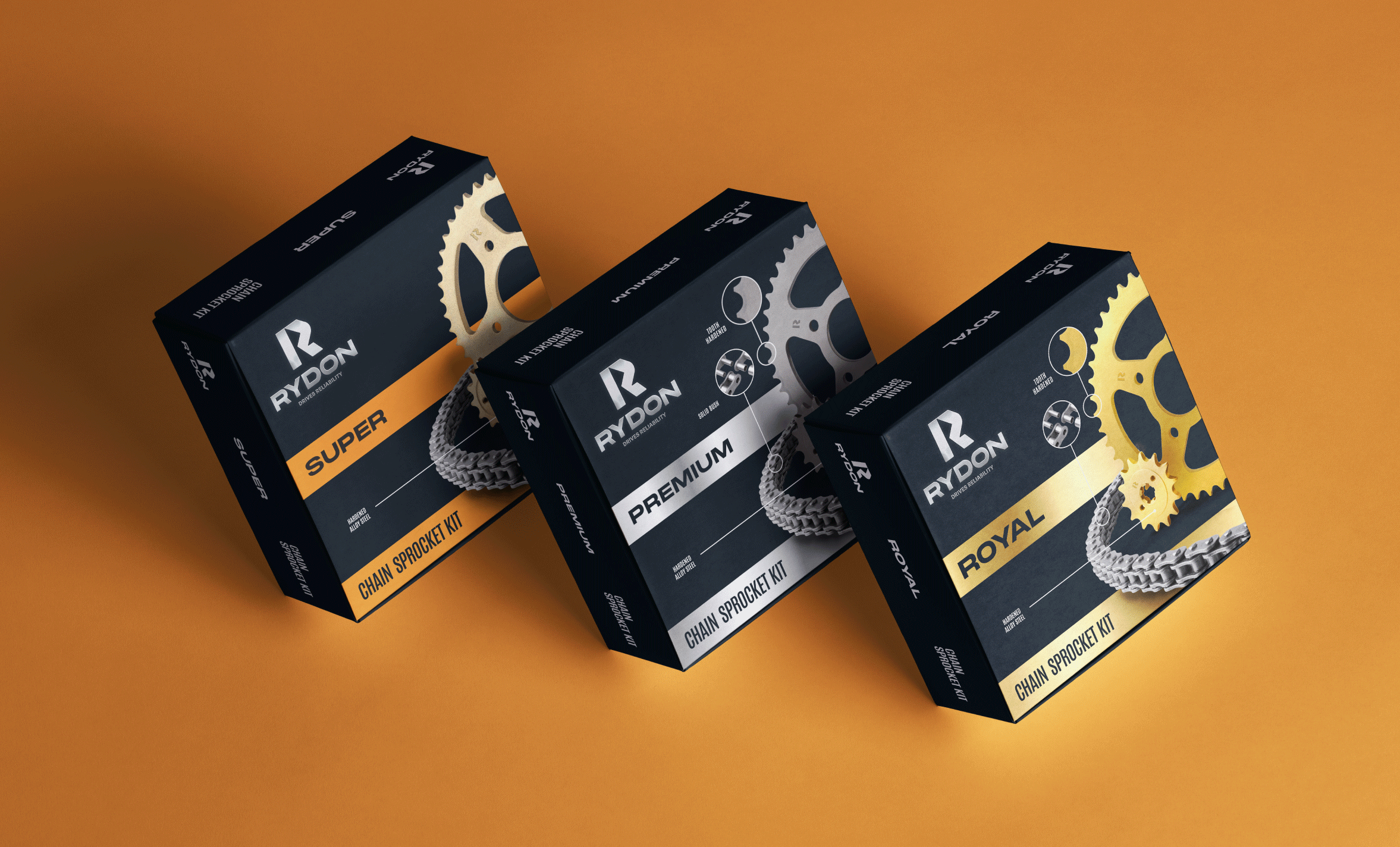
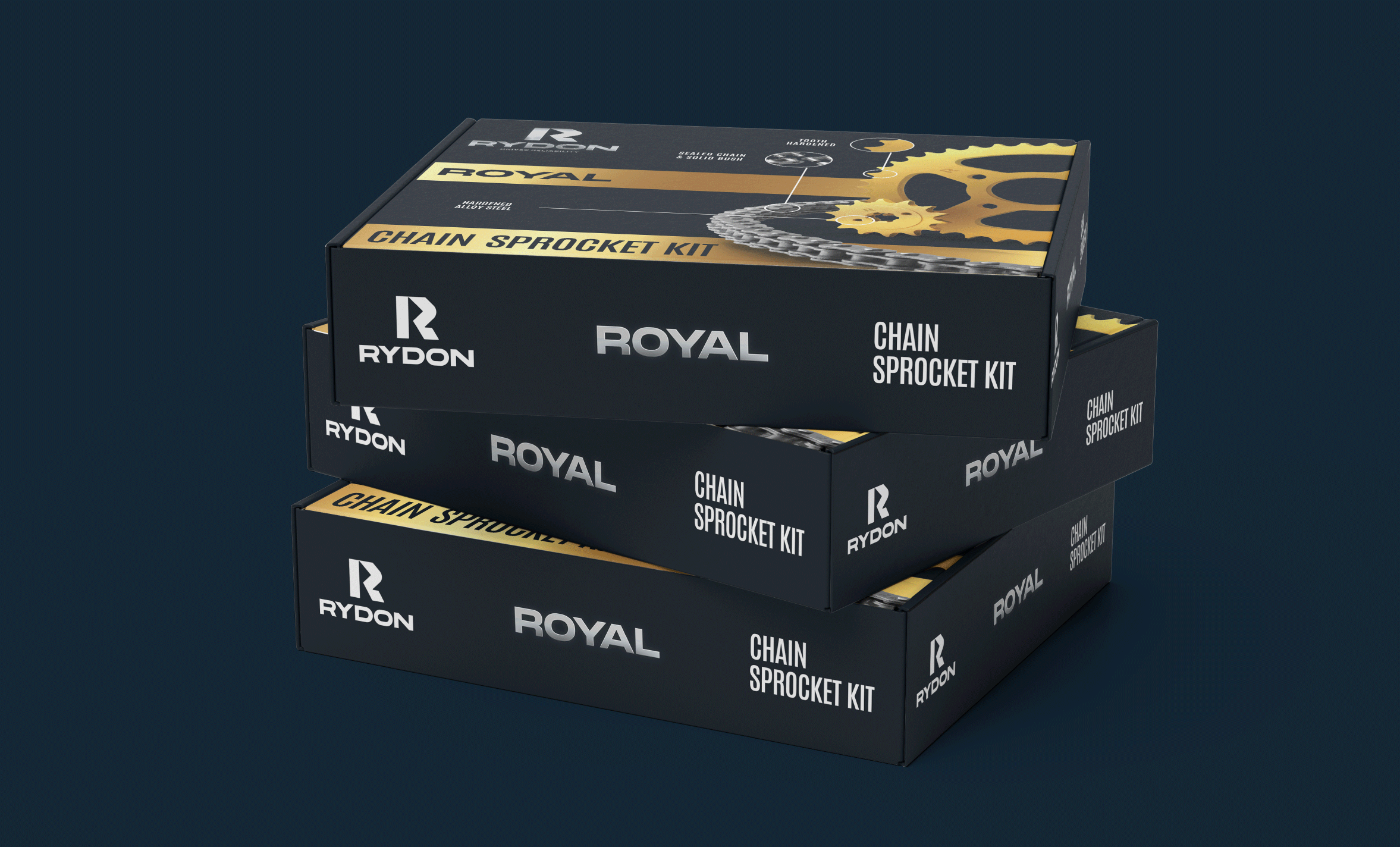
The ultimate outcome encompassed a strategically rebranded identity and enhanced packaging design. The transformation is not only visual but a testament to Rydon's commitment to progress and excellence.