Redesigning the brand mark for a hemp R&D company in bangalore.
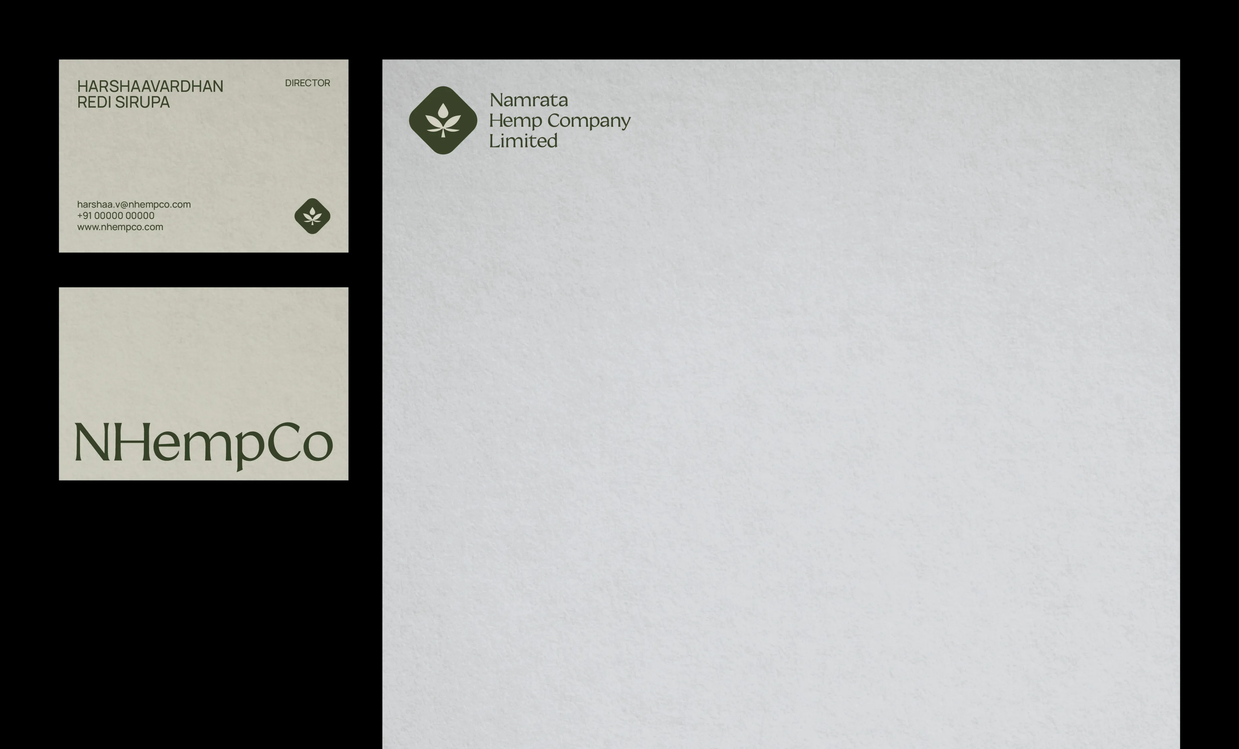
The logo was created using a simple, yet unique, approach. I designed a hemp leaf visual motif with a tear drop to set it apart from other hemp leaf logos and a smooth rhombus acting as a container, making it a very strong and well-balanced brand motif.
This project was completed by me during my design tenure at parentheses design studio


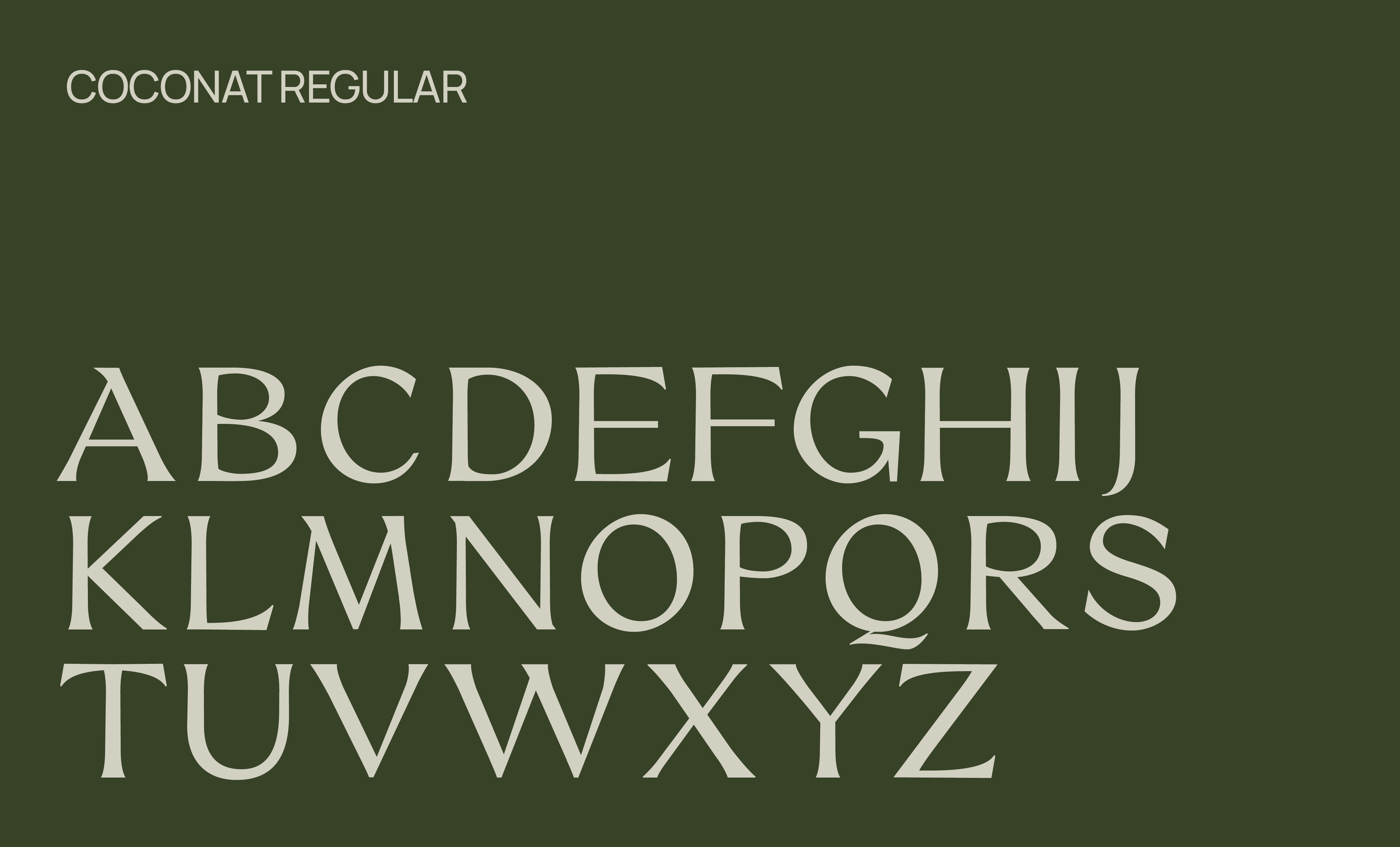
I paired this logo with a modern, contemporary serif typeface to reflect the brand's personality.


I used the natural meaning of a hemp leaf while designing the logo mark for NHEMP CO. However, I added a distinctive touch by putting a tiny drop at the top, elevating it among the conventional leaf logos. This distinguishing feature conveys the essence of the brand in a memorable way.


