Introducing a Fresh Kid’s Furniture Brand with an Exciting Visual Identity.
Totspot believes that children deserve a magical and inspiring space to grow, play, and dream. Their expertly crafted furniture is designed with both safety and functionality in mind, ensuring that each piece brings joy and comfort to little ones. I was Involved in developing brand Identity for the totspot.
This project was completed by me during my design tenure at parentheses design studio

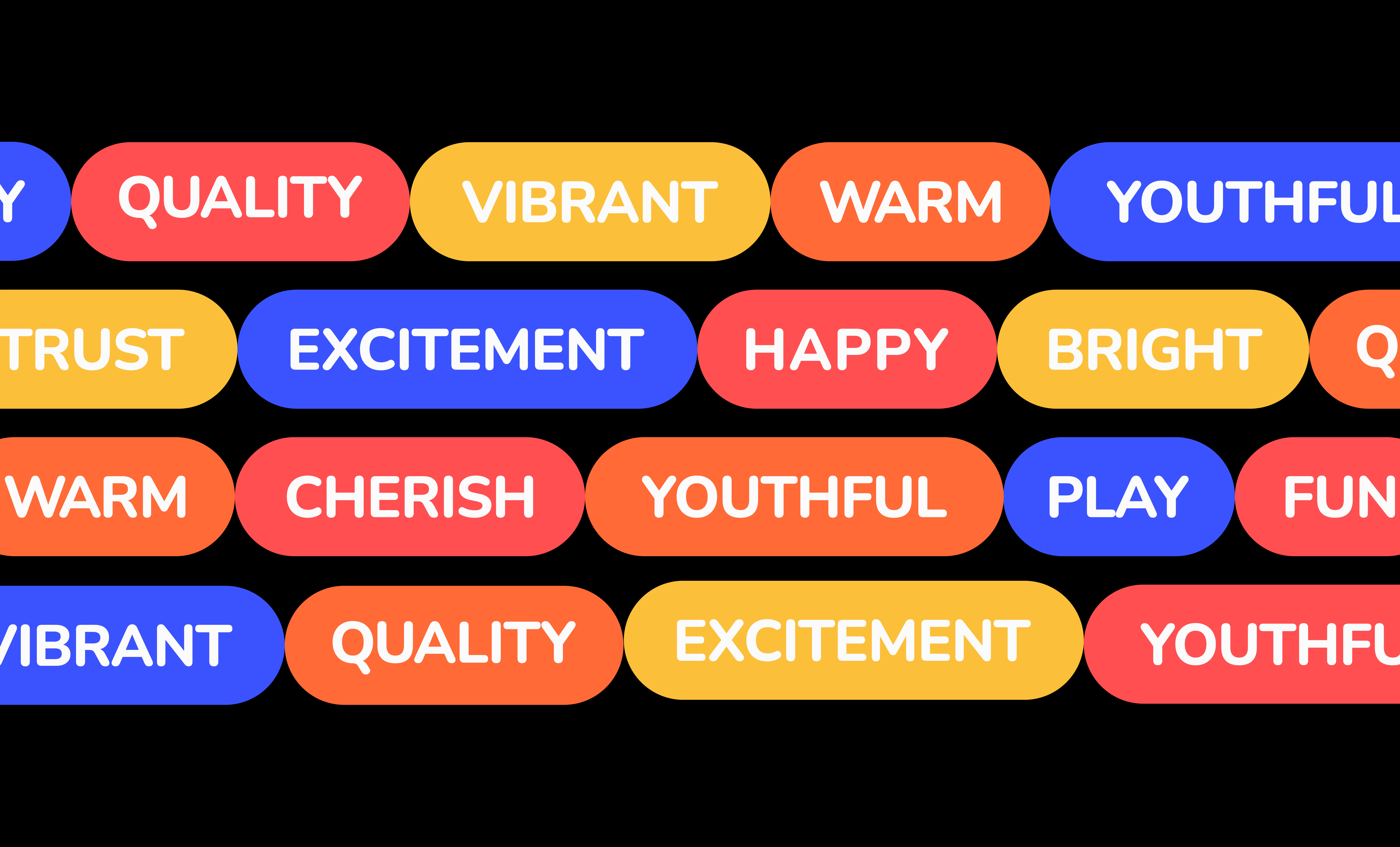

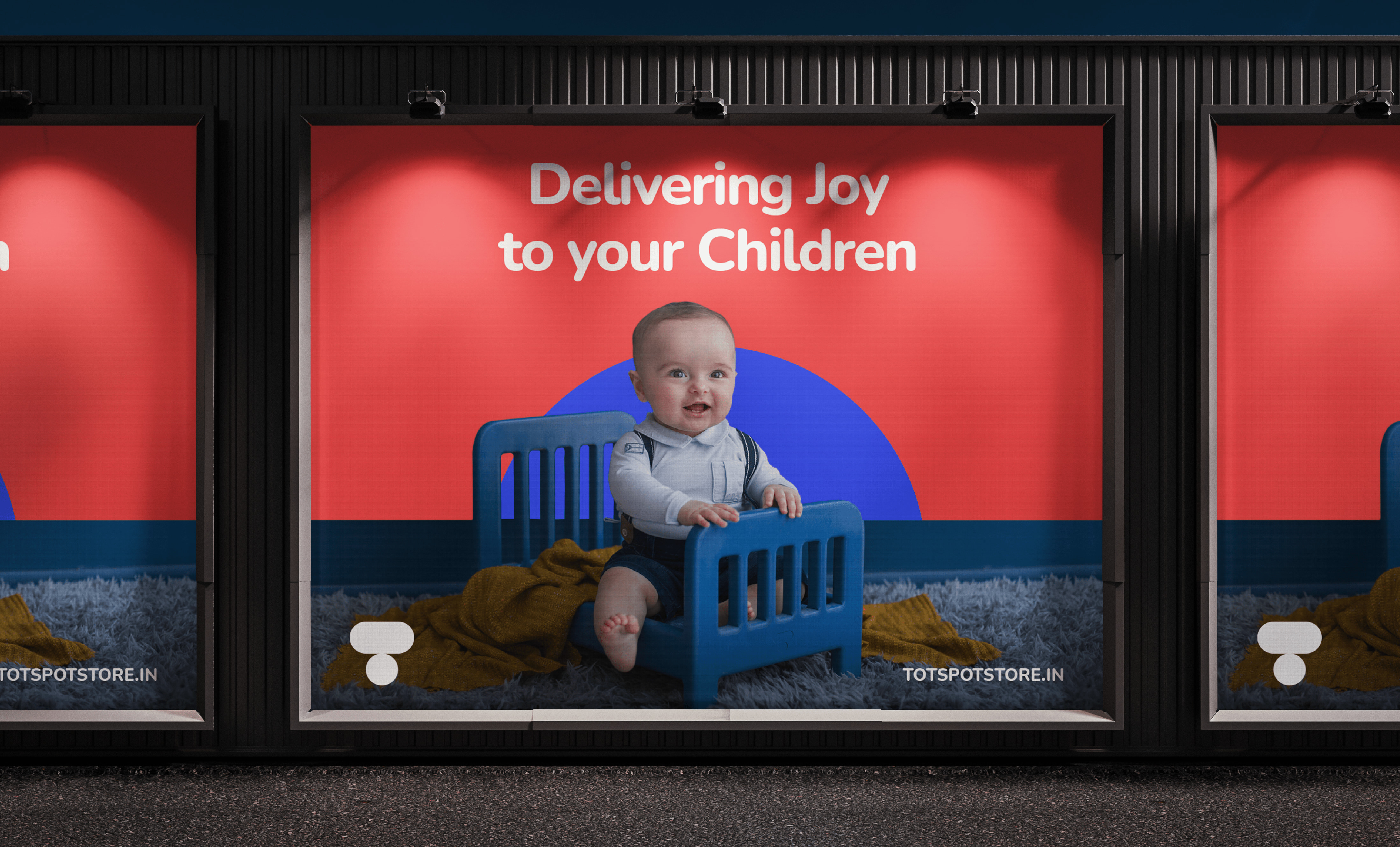
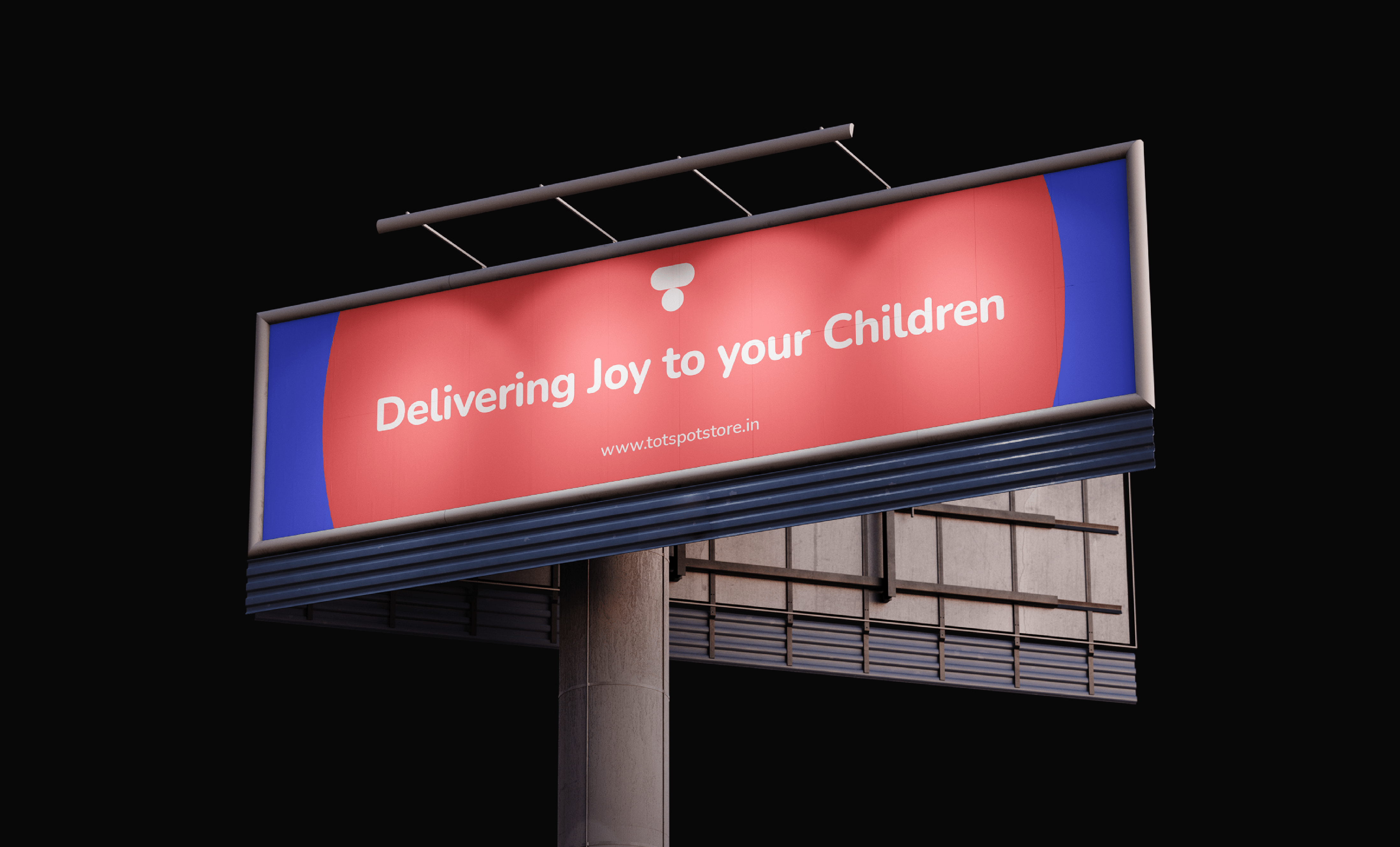




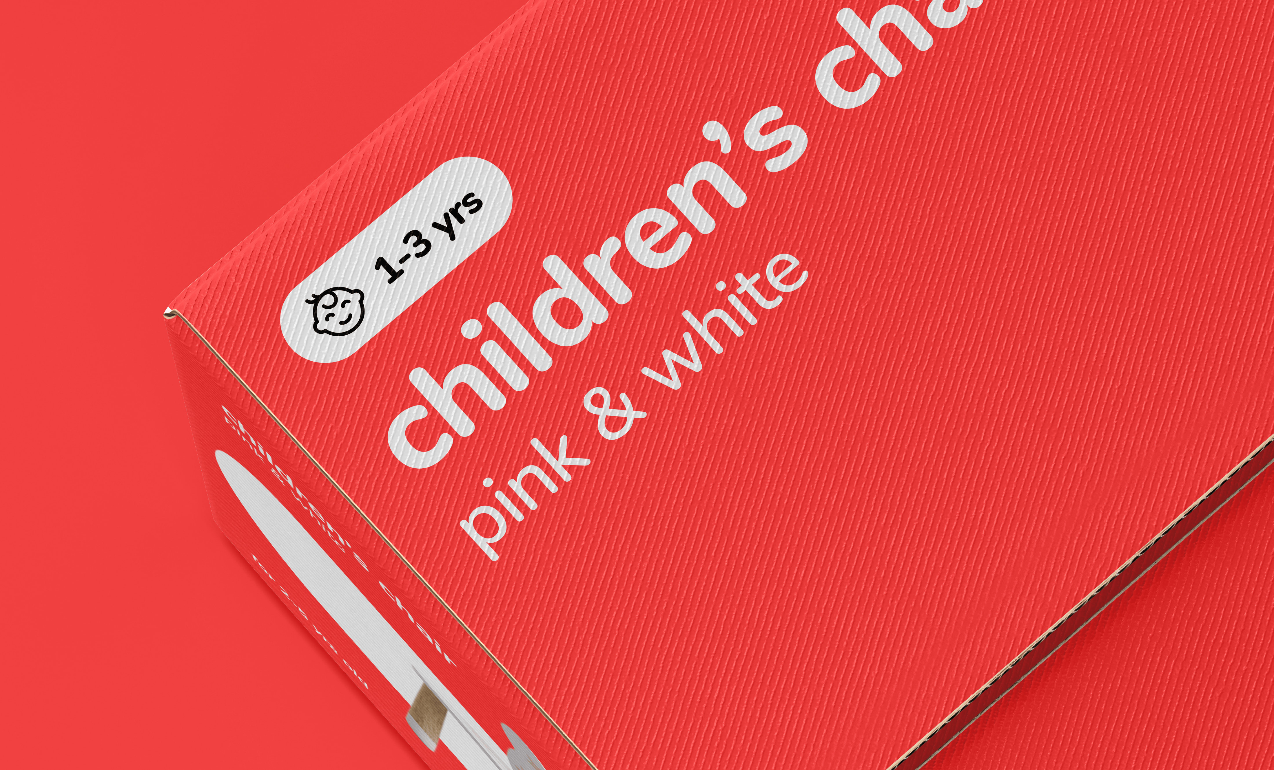
The visual identity for the Totspot brand uses simple geometric shapes that are always rounded and colourful. Through the use of colours & rounded shapes, Identity evokes the lively, fun & excitement.
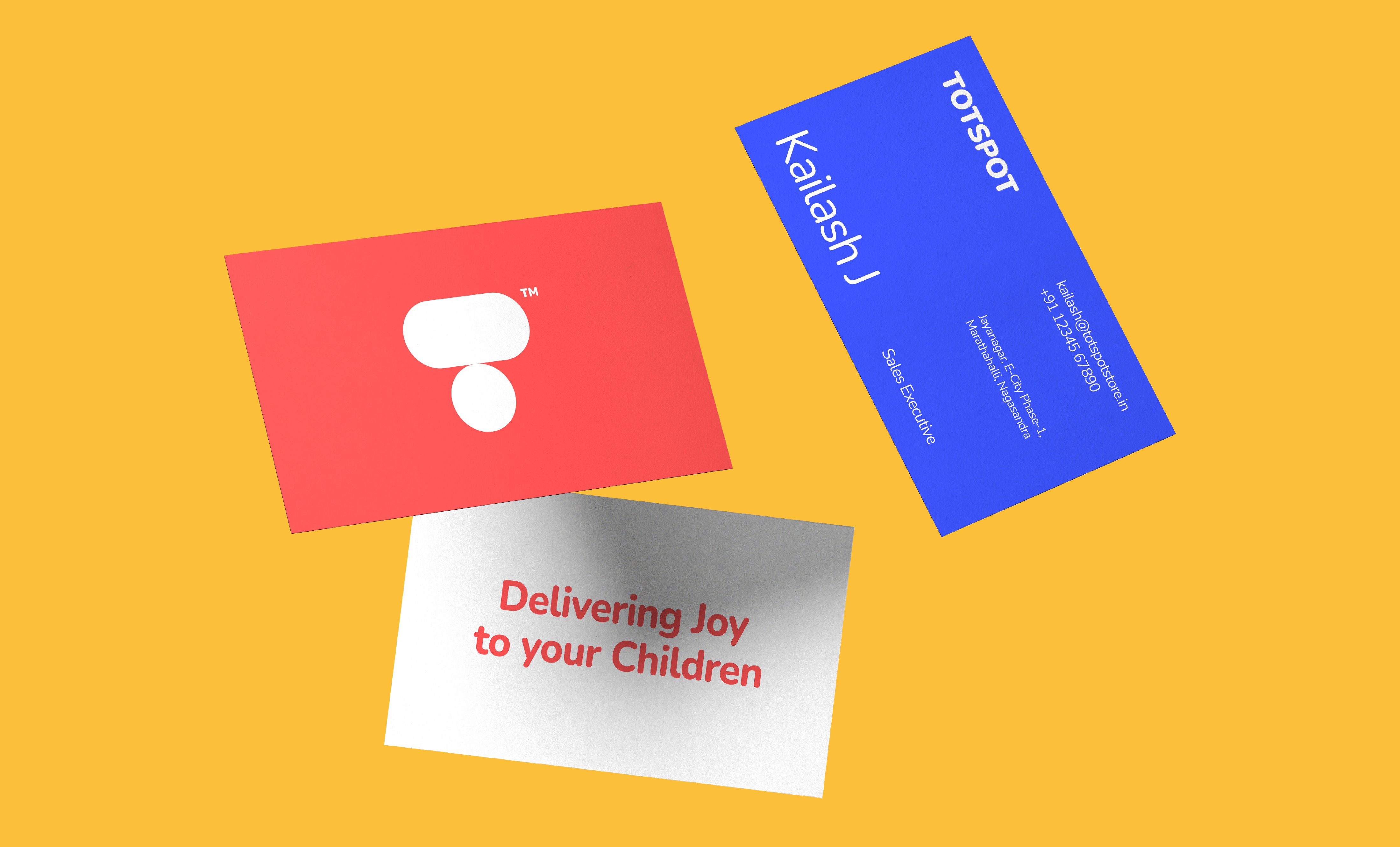
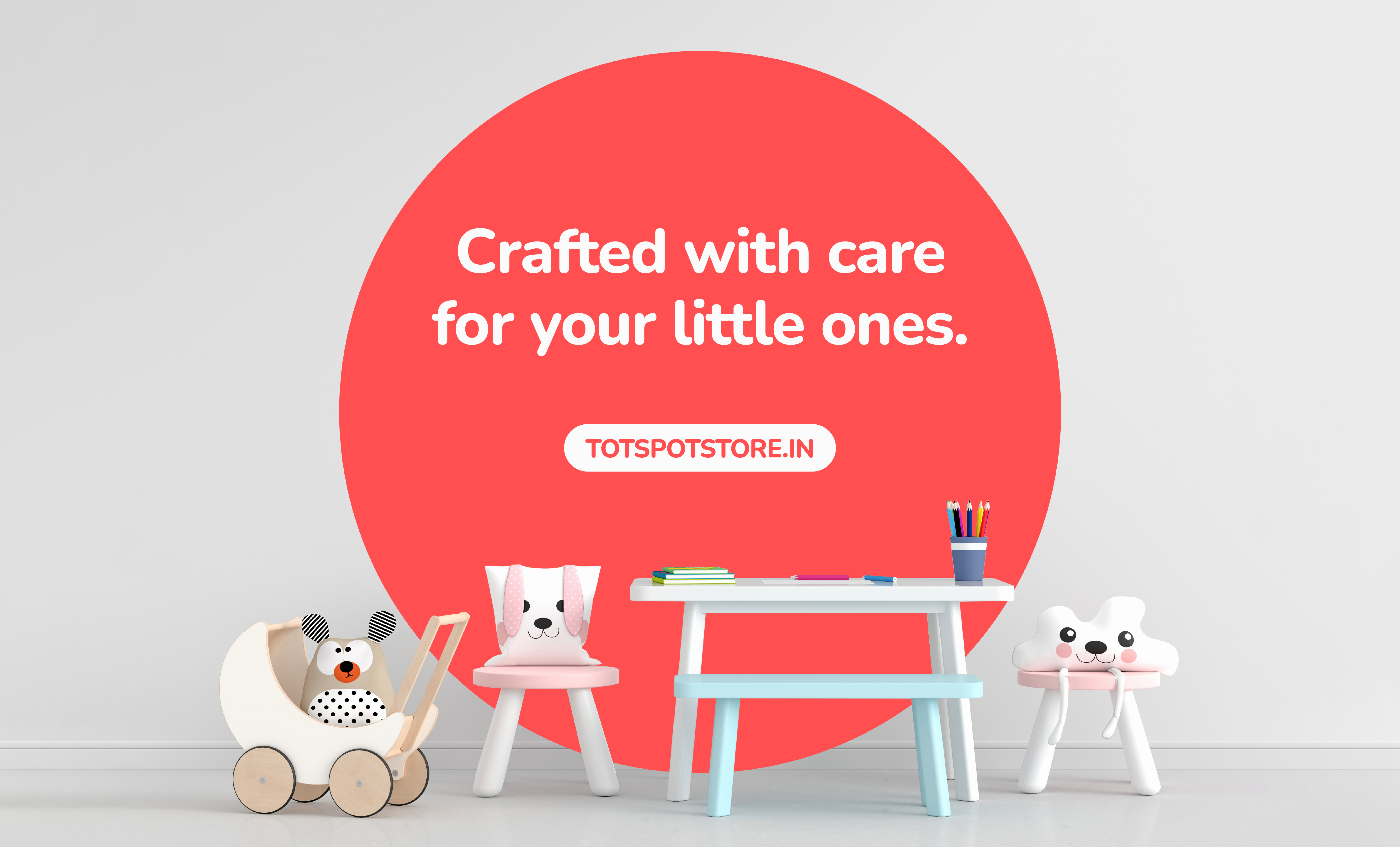

The Totspot Brand Identity captured the essence of the brand and connected with both kids and parents. The fun and colorful design elements & typography created an engaging brand image, while the clean & simple layouts conveyed a trustworthy & professional look.

