Crafting Timeless Elegance: Establishing an enduring identity for a luxury stone brand
Helios, a leader in luxury stone, and largest stone atelier in the country, needed a brand identity that reflected their heritage and quality. Through careful design, we crafted an identity for them that reflected their heritage, quality, scale, and excellence.
Helios Logo mark was created with the intersection of a circle and square - blend of stability and perfection, at the intersection lies ‘H’ symbolizing Helios.
This project was completed by me during my design tenure at parentheses design studio
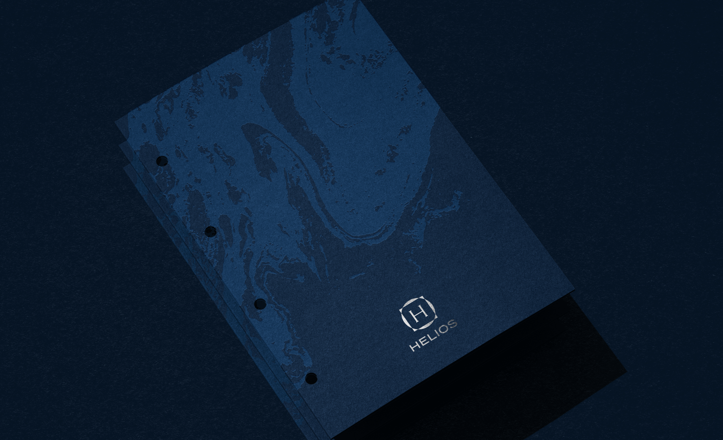
The design laguage that accompanies the logo is bold and understated, with geometric elements in premium and elegant and muted shades of blue. The geometric motifs have been taken from the logo and with a subtle sense of movement to add depth and dynamism to the identity.
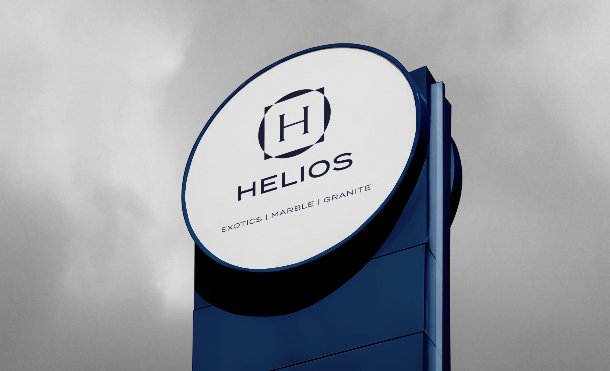
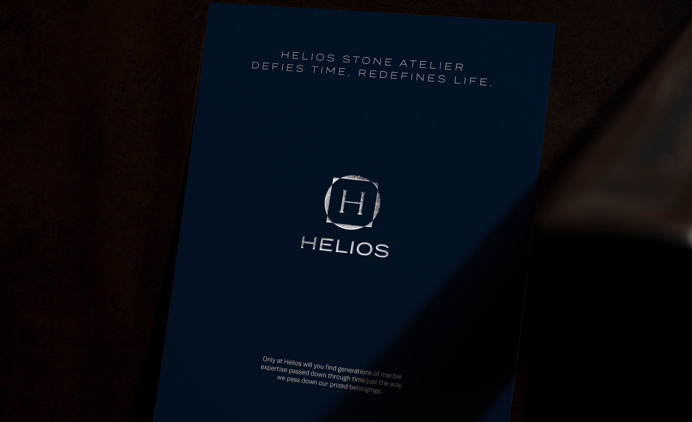
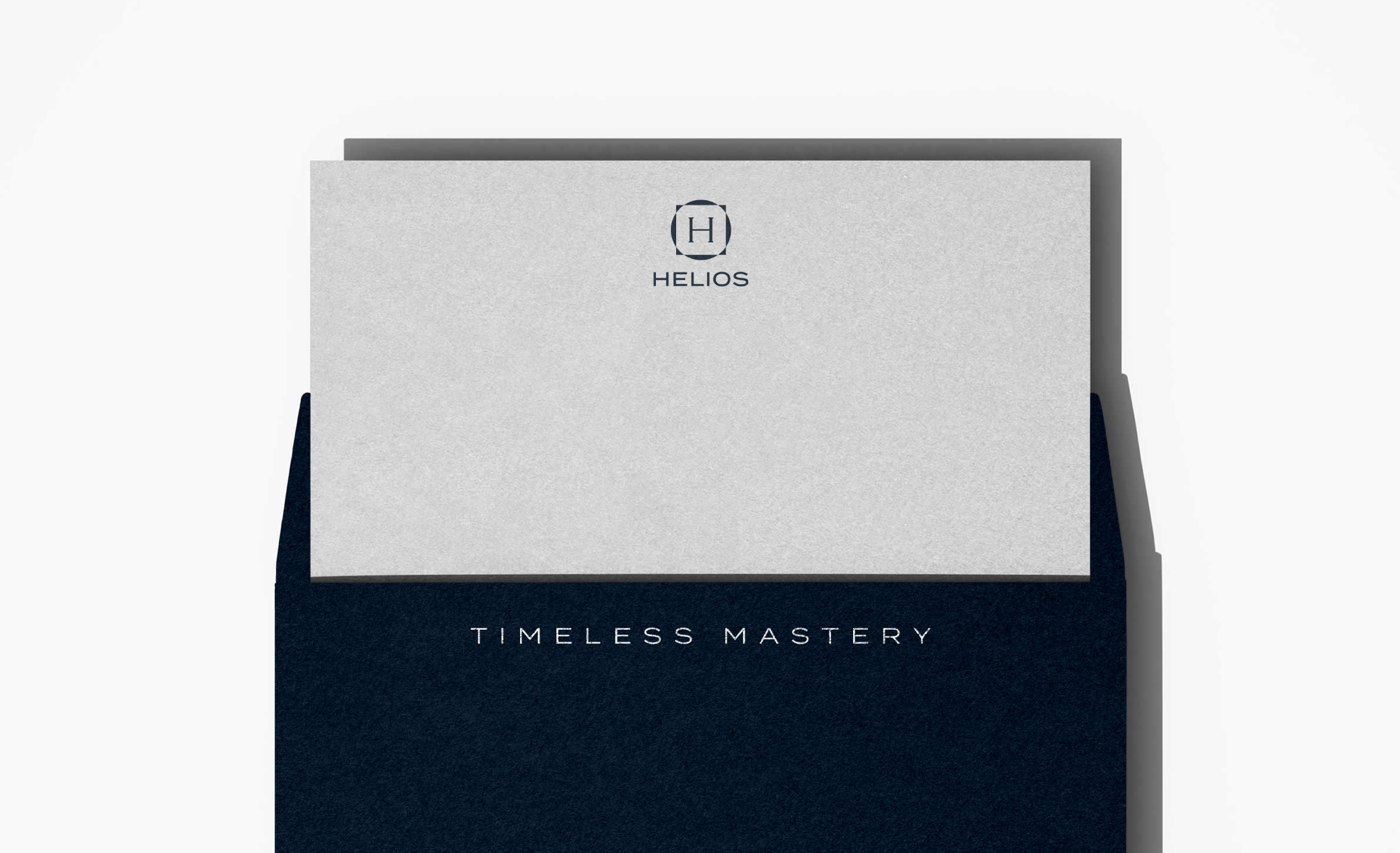
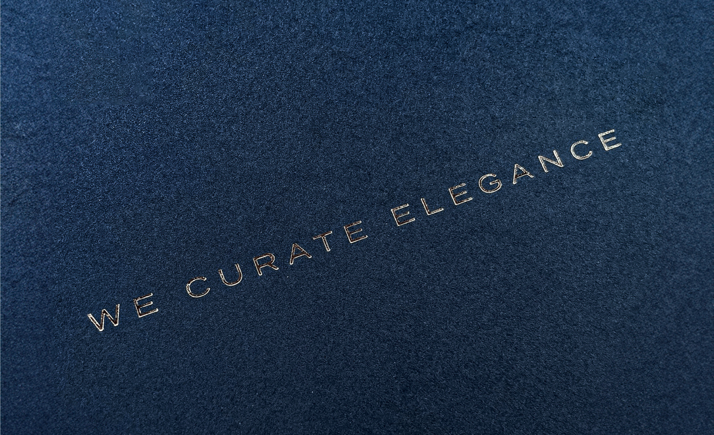
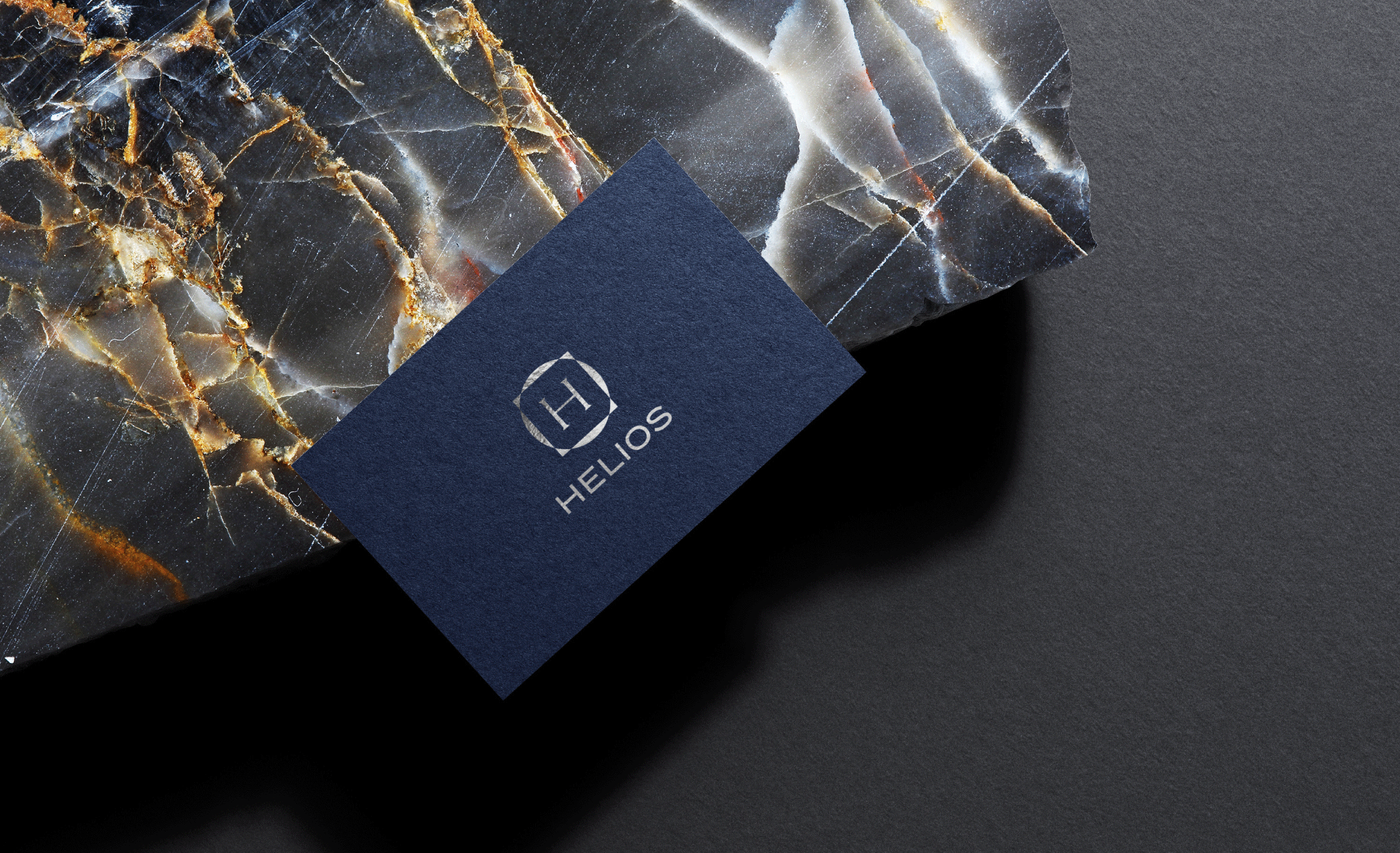
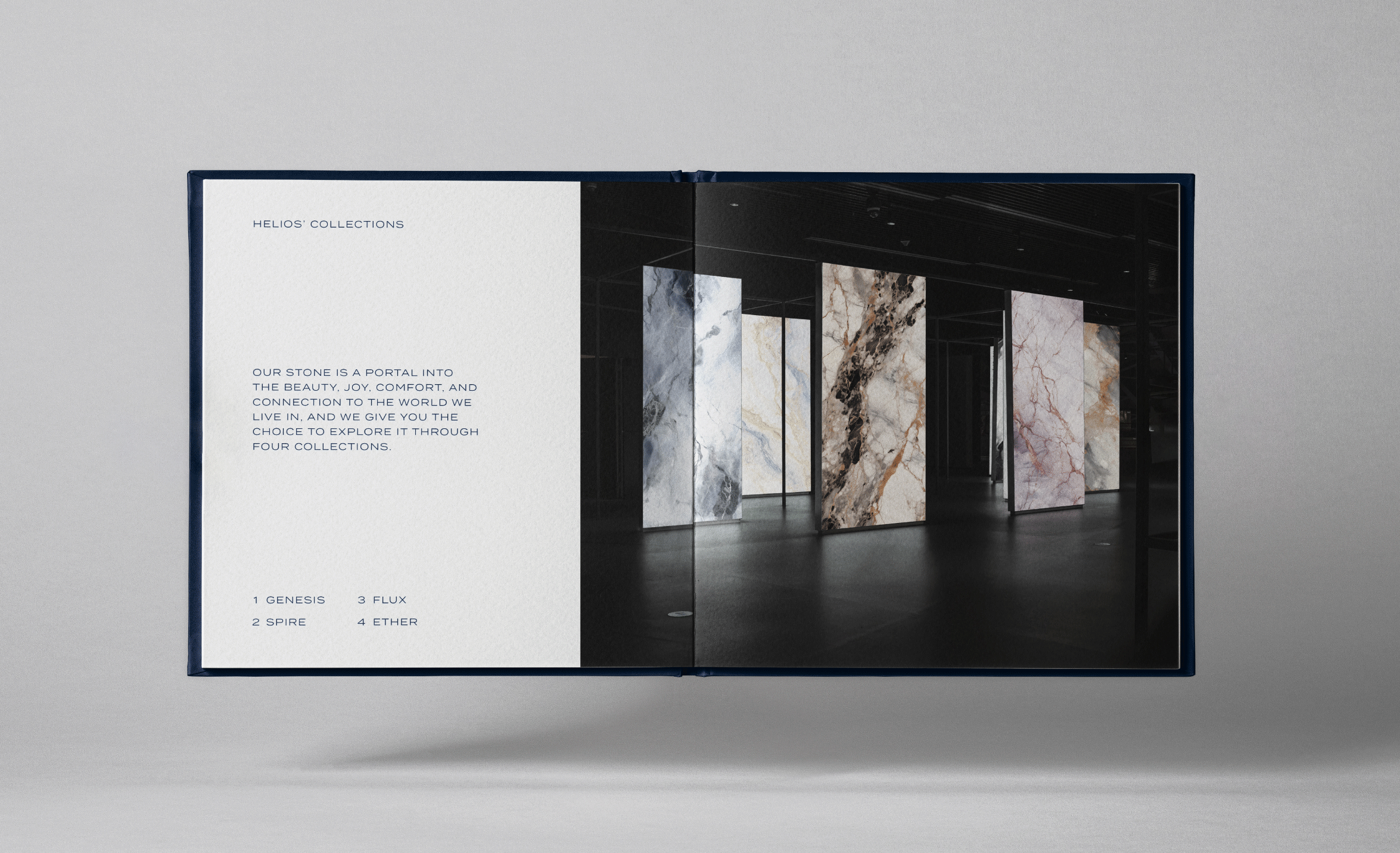
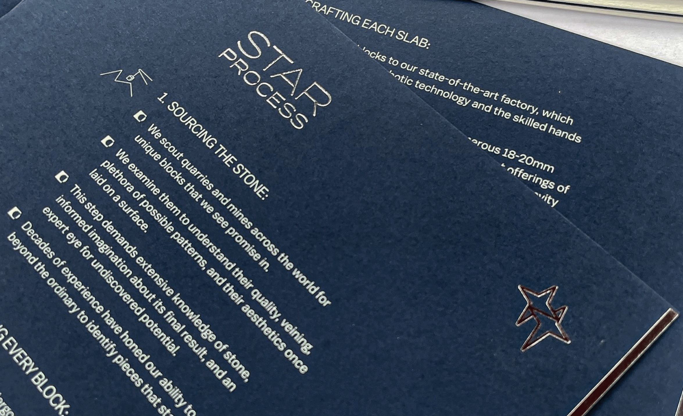
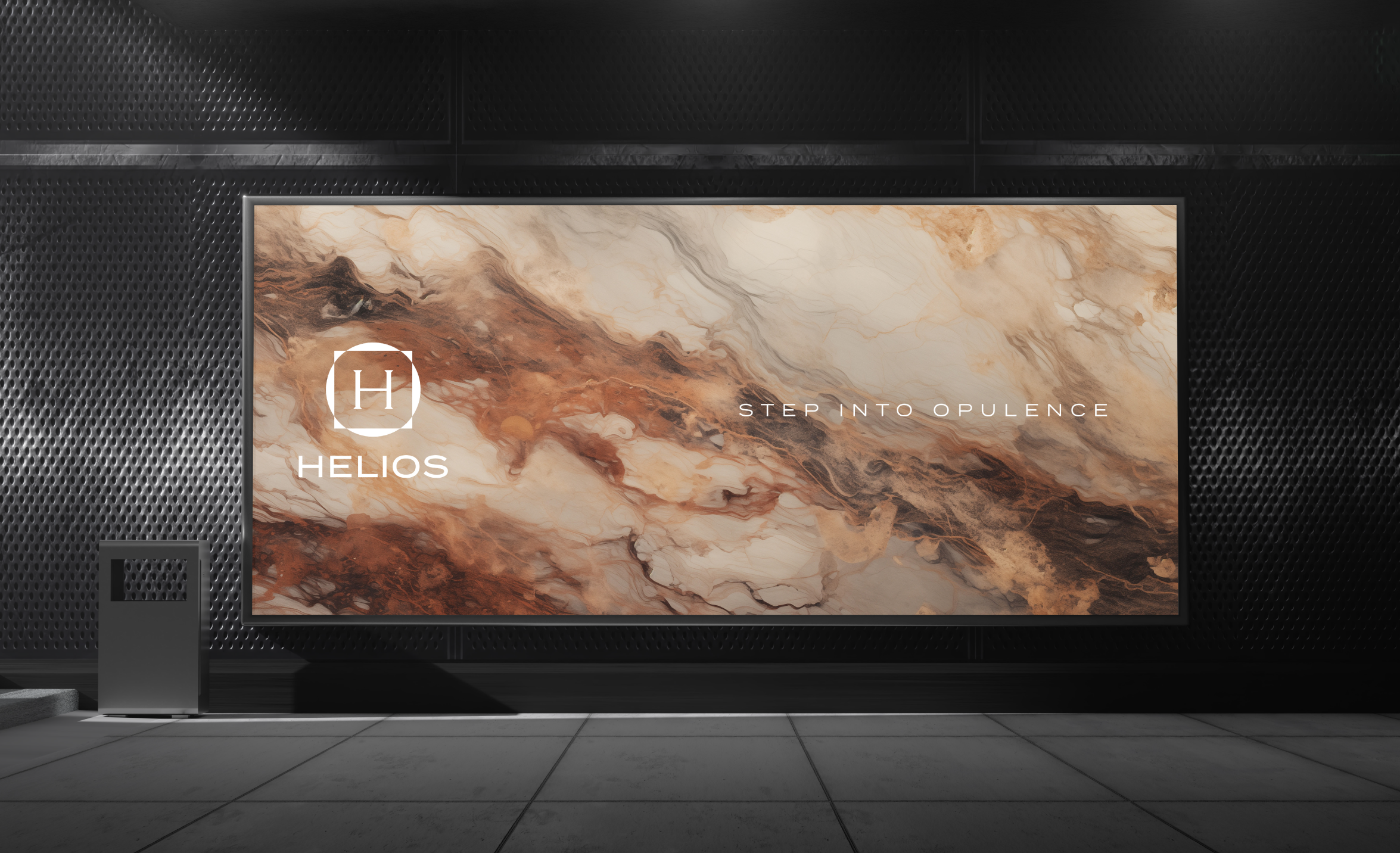
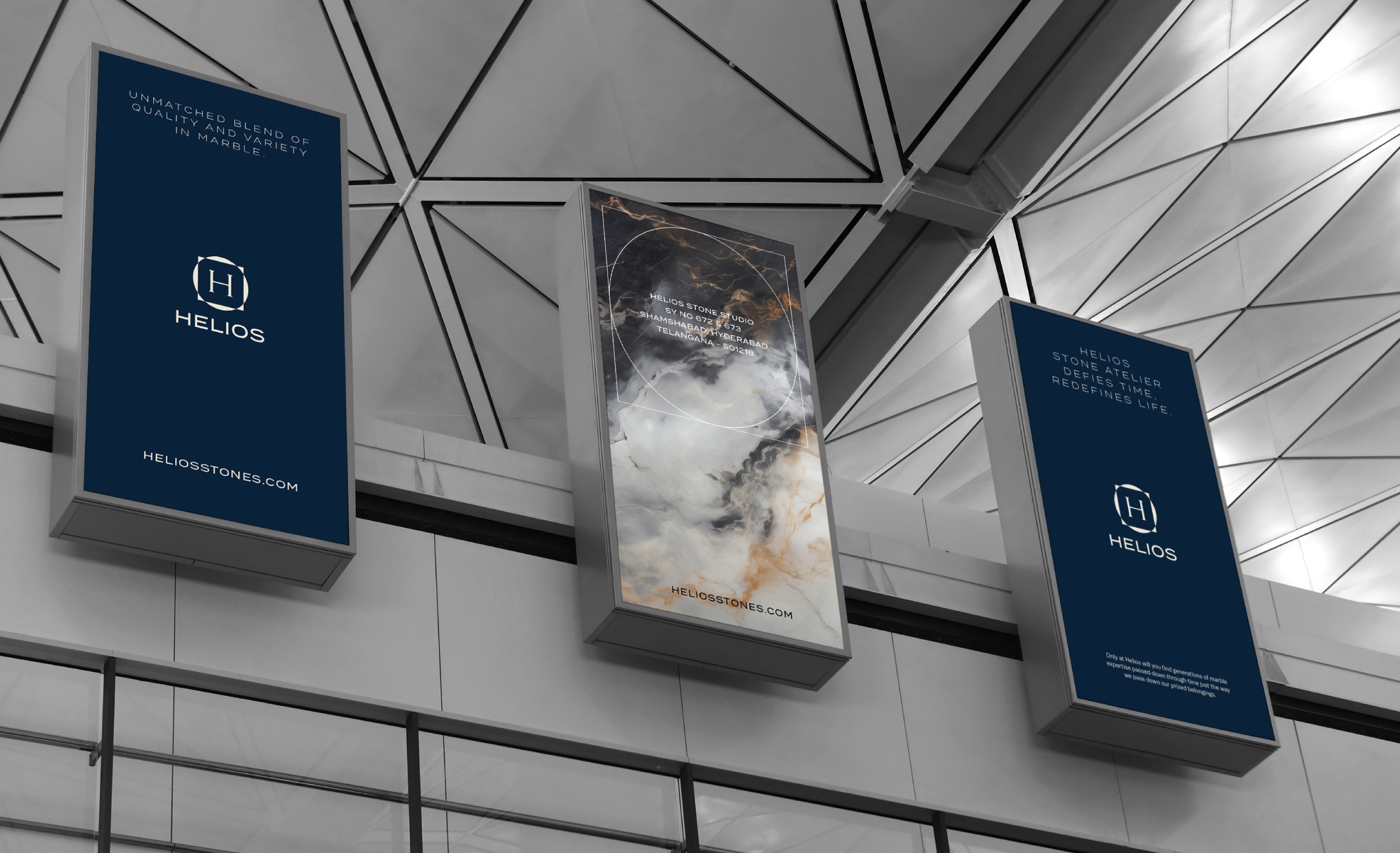
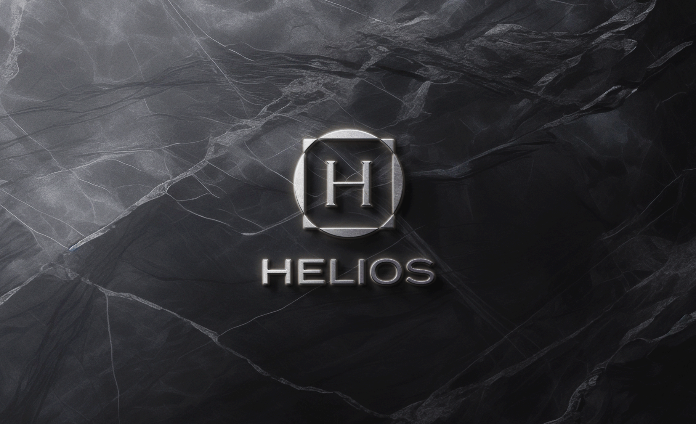
Helios identity project marks a significant milestone in redefining the brand’s presence in stone industry. The final design is a reflection of helios’ dedicated to quality, sprawling atelier, and innate timelessness.

